Archive for the ‘graphic design’ Category
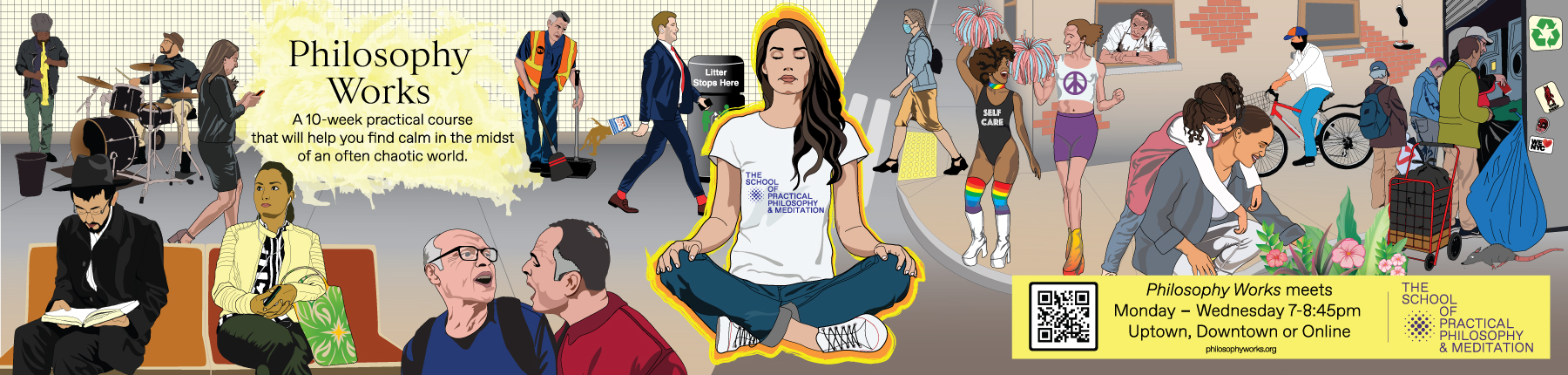
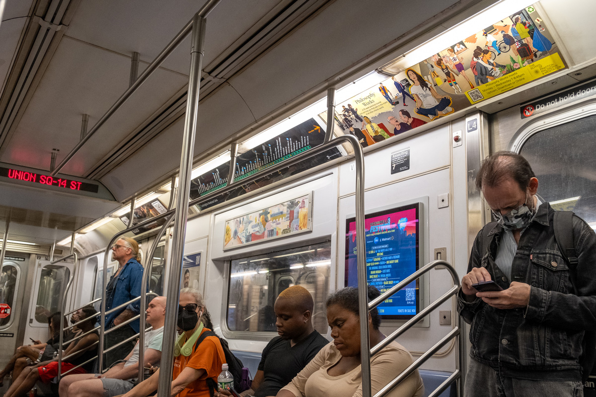
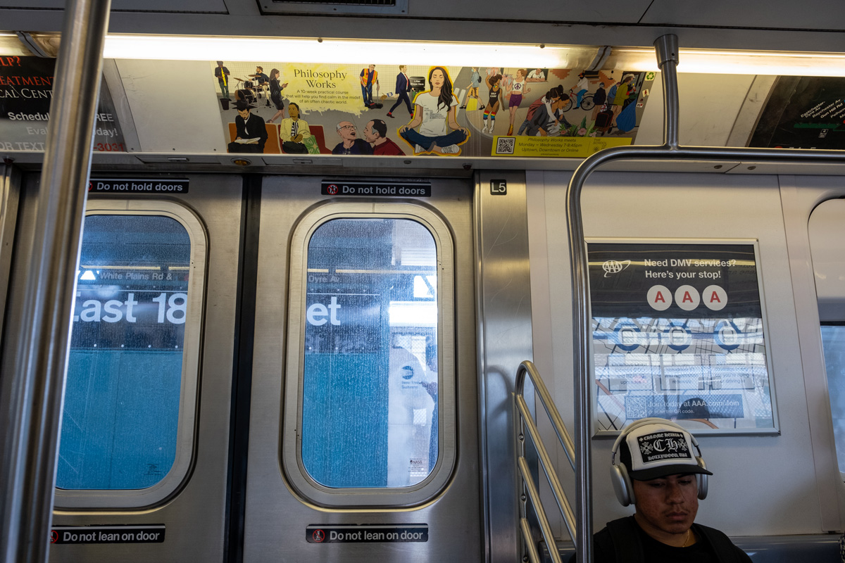
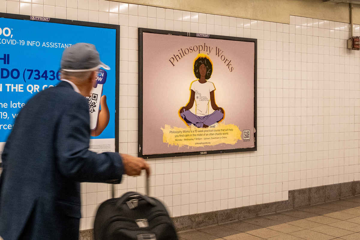
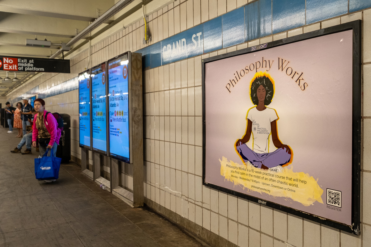
Philosophy Works Spring 2025 Campaign
Once again, I was fortunate to be commissioned to create the spring 2025 “Philosophy Works” MTA advertisement campaign for The School of Practical Philosophy & Meditation. The idea that came to mind revolved around achieving lightness of being. Visually, I thought about New Yorkers floating above the skyscrapers, and madness that is New York City. I assembled a simple mockup, below.

The idea was approved, however, a central and grounding figure was necessary. So I placed a person in stride walking directly to the viewer. The turn around time was tight and as the School had previously requested the paper cut out generative AI, I once again turned to generative AI to help create the assets for the design. I fed the individual photographs of floating or jumping people into the AI with the setting for digital illustration. I then assembled the final composition from the various assets – people and skyline. The subway platform is immediately below and then the subway car version.

As you can see, I made sure to include iconic Manhattan buildings, new and old – the Woolworth Building to the left, One World Trade Center and the Herzog de Meuron “Jenga Tower”
The main critique from the School is that the central figure looks too much like Tom Brady. However, the posters have been graffitied with “USE HUMANS NOT AI.” The next iteration should return to hand-drawn digital illustration! Oddly, although the School paid the usual cost for MTA poster distribution across platform and subway cars, I’ve only seen it on the platforms. I’ve yet to see the in-car version below.

We kept the catch phrase from the previous campaign, they didn’t go for my listing of philosophers and the allusion to the 1987 “Calgon, take me away!” TV campaign.
Philosophy Works Winter 2025 Advertisements

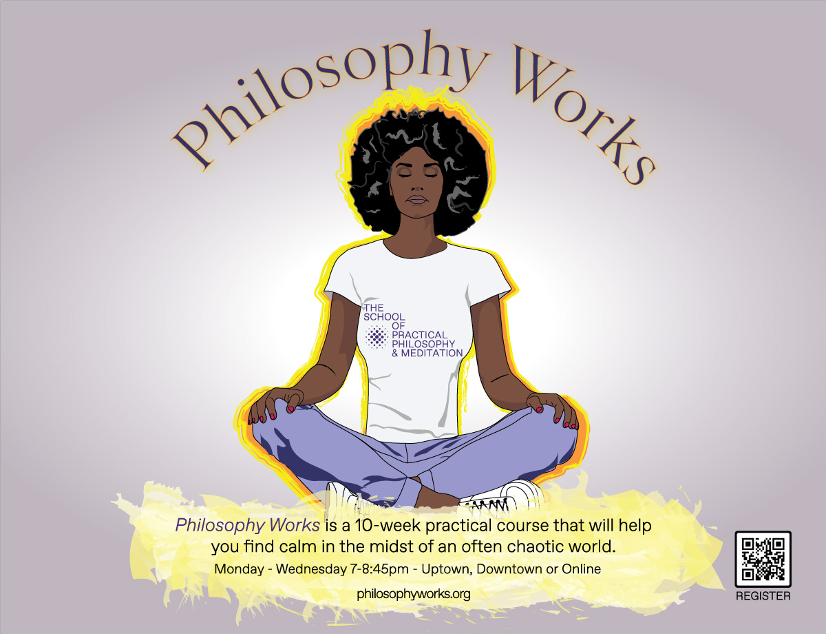
Once again working with The School for Practical Philosophy & Meditation’s Director of Marketing Jaime Sears and Marketing Consultant Adam Wasserman, I launched our initial meeting by sharing two of my favorite MTA commissioned illustrators – Jillian Tamaki and Sophie Blackall. I recounted how upon seeing these illustrations in the subway cars, I would get lost considering all the characters these artists created and the New York archetypes represented. Both Adam and Jaime were taken by Sophie Blackall’s illustrations in particular – one of a crowded scene within a subway car. Adam thought it would be fun to have our own past campaigns mounted as the advertisements within the car. Either at this initial meeting or the following meeting, Adam shared an image of a person in a meditation pose that appeared to be created from layered construction paper. In doing so, he proposed a shift in aesthetic to try something new. Adam used Adobe’s generative AI tool, Firefly to create the image. It was an exciting departure from the vector-based illustrations that I had been creating for The School and Jaime liked the aesthetic, so I agreed to give it a try.
After spending a bit of time with Adobe Firefly, I realized that getting a successful image would be a great deal of work. The tool generates a lot of odd glitches when it comes to details and of course even with highly detailed text descriptions, it cannot generate what one has in mind. Fortunately, my years of painting as well as digital composting, helped me formulate a plan – I would breakdown the image from background to foreground, treating each element individually and I would need to provide precise reference images. I would also need to correct obvious glitches.
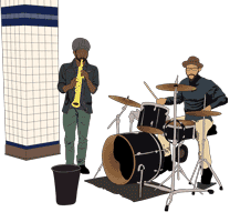
One morning, I got up early to photograph an empty subway train as well as individual passengers to use as reference images. I composited multiple images of one side of a subway interior, to delete the center pole and expand the width of a single bench. The empty car composite as a reference successfully generated the setting for the poster. The image below was the team’s favorite.

I removed the backgrounds of individual riders to simplify the reference images. However, even with this step, I needed to carefully mask the Firefly characters from their backgrounds to set them on the subway car bench and of course digitally corrected many oddities.

I considered the elements that make riding the New York City subway unique in comparison to other cities such as musicians and dancers. Online I found a mariachi bassist, as well as a pole dancer to use as reference images. All three of us, Jaime, Adam and myself, felt that these two characters were what made the image engaging. Unfortunately, upon review, the MTA flagged the two characters and they had to be deleted.

I recycled past illustrations to generate a few of the characters such as the two women toward the left of the poster, the central meditator and the man reading a book at the far right. The dog in a hand bag was the result of searching for countless reference images and coming across an article about the COVID uptick of dogs on the subway. The aura behind the meditator required masking, gradients and fiddling with opacity to get it right.

Lastly, I worked on the subway car windows and the elements outside the car. Between Illustrator and Photoshop, I created a gleam as a window effect. I found a photograph of a flying pigeon as a reference and used NYC skyline images to help generate the buildings in the distance. To the right, I added a blue gradient for the copy and fussed with text to have it fit nicely.
The Marketing Team came up with the catch phrase “ELEVATE YOUR EVERYDAY.” We tried a few fonts before landing on the sharp and clean Futura bold with a drop shadow to finalize the poster.

The platform poster was a good deal quicker as it consisted of one character, reuse of the aura and relatively minor digital editing of the background. However, I consider it a boring poster that does not reflect the nuances of New York City.

As much as I enjoy the final in-car image, my takeaway regarding Adobe Firefly is that it’s useful for quick brainstorming and quick graphics for social media and email announcements. However, for a high-quality print image, Firefly generated images require a great deal of planning and painstaking digital retouching. Also, I did not mention the many many images generated before getting the ones that I could work with.
Philosophy Works Fall 2024 Advertisments

As the School for Practical Philosophy & Meditation prepares for the fall registration, I again worked with creative director Jaime Sears and digital consultant Adam Wasserman to create the new advertisement campaign. We began by considering current events and New York City realities – the protests due to the ongoing Israel-Hamas War, upcoming national elections, heightened political tensions, rising rents… And yet New Yorkers are incredibly resilient. Tourism appears to be thriving. Based on the heavy daily traffic, it appears that the city is hard at work. New building projects are everywhere and there isn’t enough housing. New immigrants are increasingly integrated into the city life… We sought to create an advertising campaign that captured the ongoing unrest while also celebrating the resilience of New Yorkers and adjacent to it all, the peace that one may achieve through philosophy and meditation.

I created a few new illustrated characters in meditation, two were selected. I scoured the web for New York City silouette landscapes and combined and reworked vector files to generate a city background. I also reworked silouettes of people protesting. I created two variations of this scene, one with characters that I had created and another only with silouettes. For the platform poster, I used a graphic AI to generate images of NYC residents protesting. It took many prompts to have an image generated that I wanted to work with. I vectorized the image, reworked it and then superimposed one of the meditating characters along with the text theme we landed upon: “PEACE BEGINS WITH YOU.” And the copy begins with the question “Struggling to find your place in a chaotic world?” The greater space of the platform poster permitted us to broaden the copy with a few of the outcomes from the introductory course “Philosophy Works”: learn timeless wisdom, focus, happiness and inner-strength.

Spring 2024 School of Practical Philosophy & Meditation Advertisement Campaign
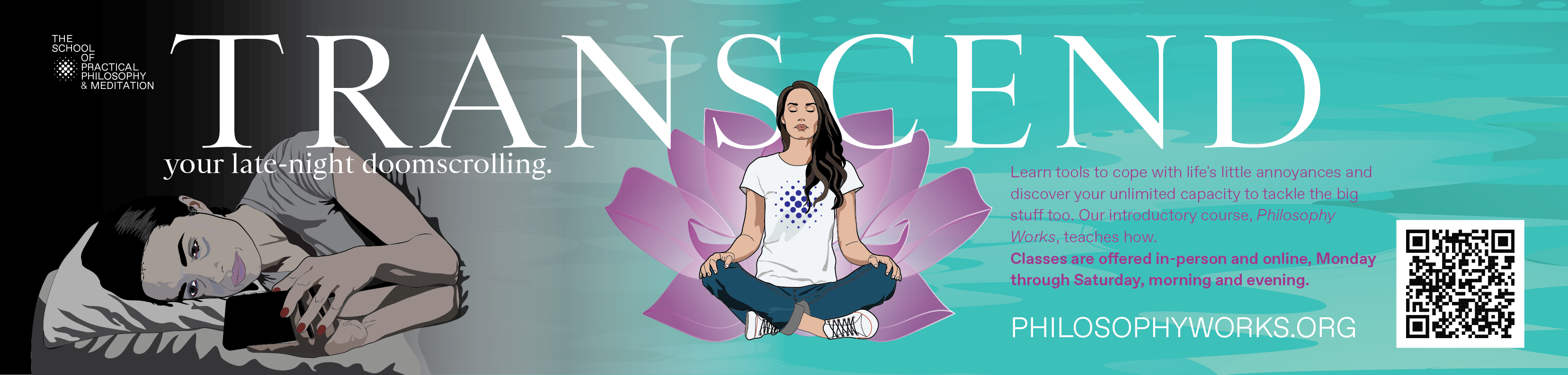
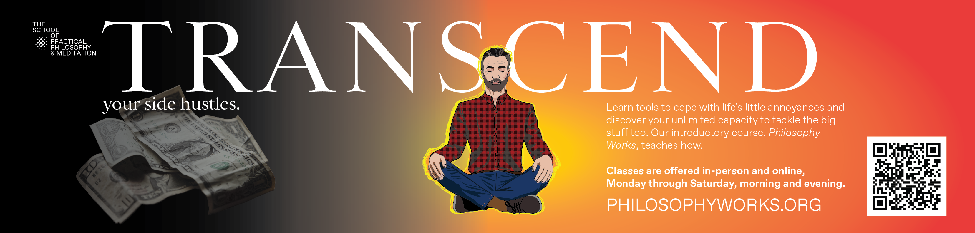
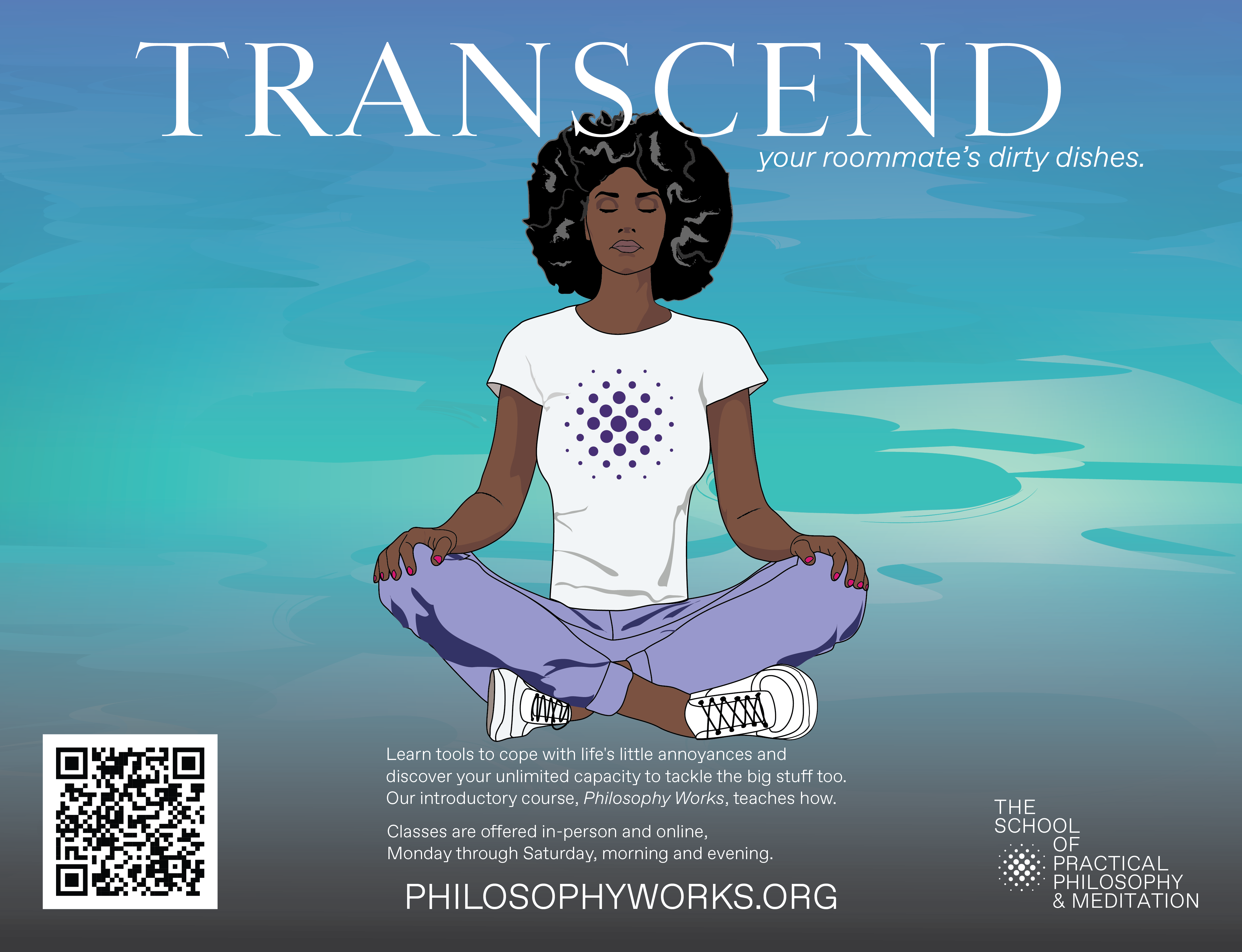
Jaime Rathore, the creative director for the advertising campaigns for The School for Practical Philosophy & Meditation once again hired me to create the MTA subway posters for the School. This time we worked with fellow School member and digital consultant Adam Wasserman to help generate ideas for the posters. Adam presented several ideas, the one that was selected features the word “TRANSCEND” trailed by a phrase that reflects common nagging realities (at least common to New Yorkers). A few of these phrases were:
- your late-night doomscrolling
- your roommate’s dirty dishes
- slow walkers
- your eight side hustles
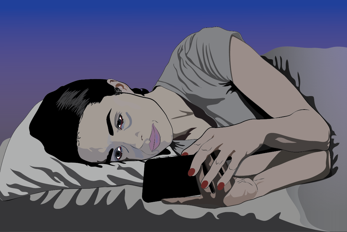
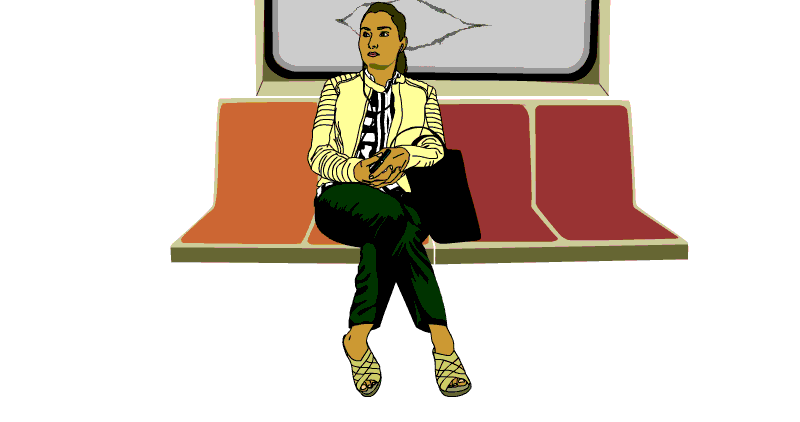
The three that resounded best were: “TRANSCEND your late night doomscrolling,” “TRANSCEND your side hustles” and “TRANSCEND your roommate’s dirty dishes.” As both the budget and time were tight, I was asked to reuse some of the recent artwork. I did, however, create a new illustration for the doomscrolling concept (pictured above) as I didn’t have an appropriate asset. Below are the two in-car subway posters that will be presented above riders’ heads and one platform poster. Adam suggested editing the illustrated characters’ t-shirts from showing the entire School logo and name to only showing the logo (which I think works nicely).
Winter Ad Campaign for the School of Practical Philosophy & Meditation
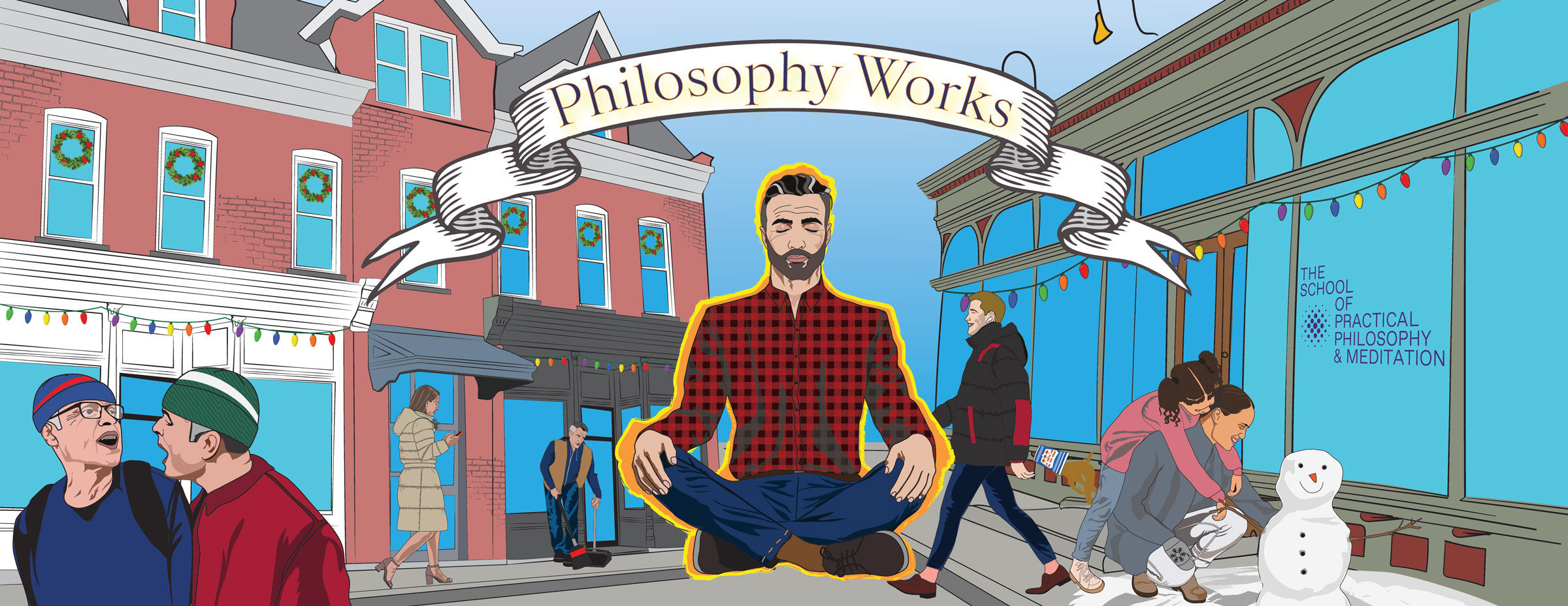
The winter MTA subway campaign’s in-car poster remained consistent with the fall design. However, the characters were given winter coats, beanies, the LGBTQ revelers became New Year 2024 revelers. The two men arguing along the bottom left were given NY sports team colored beanies. The mom and daughter to the right are making a snowman instead of tending to a garden. The bike deliver person has been given a winter coat, gloves, helmet and food delivery backpack. If one zooms into the helmet, it is decorated by WAK – WAK is the pronunciation for the Mayan hieroglyphic representing the number six. Places labeled six are cosmic realms in Mayan writing. As an ear decoration, this rendition of WAK wears a smart phone.
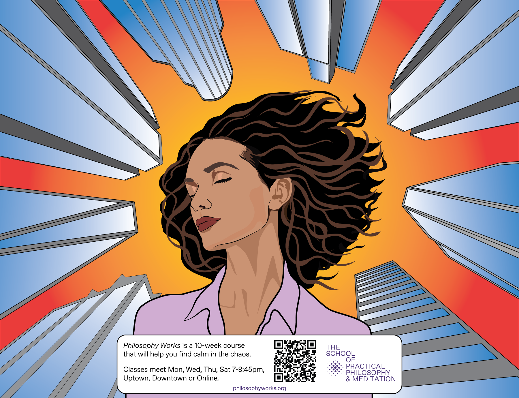
For the subway platforms, the creative director, Jaime Sears requested a new design. She envisioned a woman against skyscrapers, at ease as if meditating amidst the magnitude and intensity of New York City. Following her concept, I created a series of glass towers from the street perspective and placed a young woman with her eyes closed at the center, the towers rising all around her.
Lastly, I was asked to create a design for the Wallkill postcard. The budget was small and I was asked to work with existing assets, so I created a new setting and recycled the NYC characters. Linda Engler, a longtime member of the School who lives near the Hamlet of Wallkill where the School has an estate took photographs of New Paltz Main Street. Linda took the photographs to provide me with source material for the postcard. I used a photograph of the Indigo Velvet and Rock Candy Vintage building to help illustrate a New York town setting. I maintained the concept of an individual in meditation as the central element while other characters go about their lives. Hopefully, the postcard will visually engage viewers and draw them into learning about the School of Practical Philosophy and Meditation.
Immersive Worlds Podcast
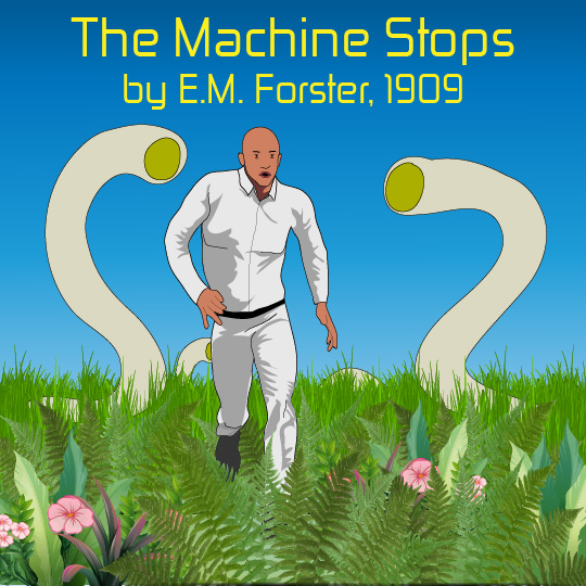
I have been a “New Media” professor since 1999 and while teaching technical production courses, I have learned that it can be inspirational for the student to interweave fiction into these courses. The short stories that I select relate directly to the technical material, such as web development. For example, a story such as E.M. Forster’s 1909 “The Machine Stops” is both inspirational and illuminating. Most students do not consider how a 1909 fiction may reflect contemporary life. Over the years, I have developed a list of such readings and I have decided to read, record and publish these readings. Although I am not a voice actor, I hope someone might enjoy these readings. (I am also enjoying creating the illustrations for these readings.)
The recordings are available via the browser and as a Podcast:
https://www.ambriente.com/immersiveWorlds/
https://www.ambriente.com/immersiveWorlds/index.xml
Apple Podcast link: https://podcasts.apple.com/us/podcast/immersive-worlds/id1707925334
There are currently two stories available:
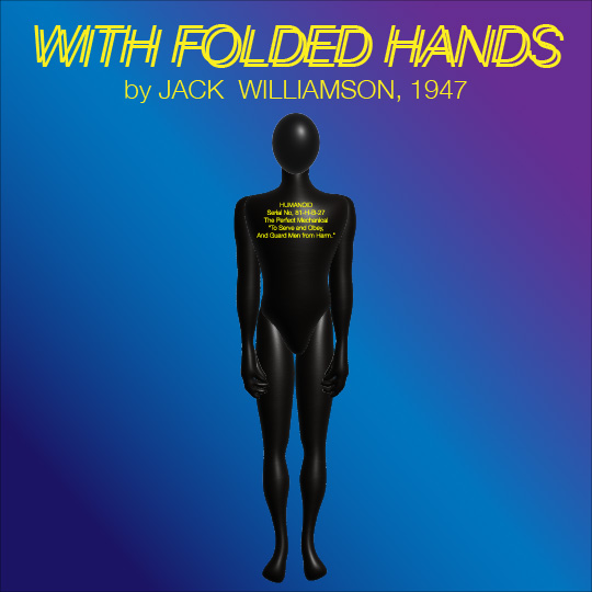
“The Machine Stops” by E. M. Forster published in November 1909 issue of The Oxford and Cambridge Review. Perhaps due to radio and an expanding telephone system and inventions such as the Nipkow disk and mechanical televsions Forster was able to envision people communicating via hand-held discs. But even with these 19th century inventions, Forster’s world in which people live in isolation and communicate via a live image seems incredibly prescient. Due to apocalyptic wars, humanity retreated into the earth and constructed a gigantic machine to tend to all their needs. After hundreds of years, the Machine is a god-like construction, until it begins to break down.
“With Folded Hands” by Jack Williamson published in the July 1947 issue of Astounding Science Fiction. Following World War II and the atomic bombings of Hiroshima and Nagasaki, Williamson felt that “some of the technological creations we had developed with the best intentions might have disastrous consequences in the long run.” Today, with the rising use of artificial intelligence, Williamson’s short story seems as relevant as when it was first published in 1947.
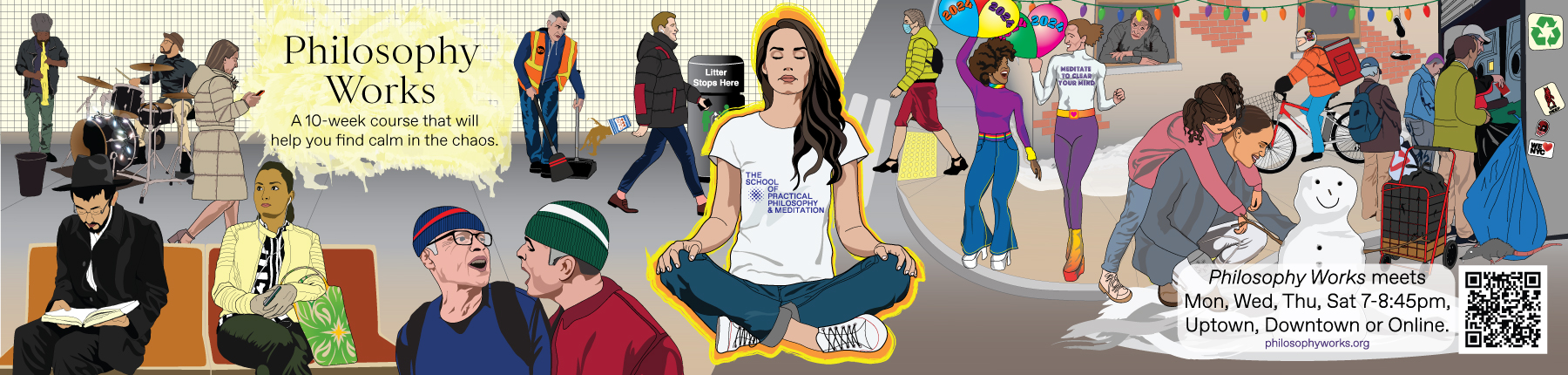
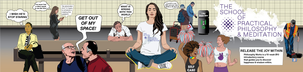
Philosophy Works 2023-24 Ad Campaign
“The School of Practical Philosophy & Meditation offers a journey of self-discovery that guides students toward understanding their innate wisdom and appreciation of the underlying unity connecting us all. Philosophy Works, the introductory ten-week course, prepares students for mantra-based meditation, an offering upon completion.”
THE CHALLENGE
In-person enrollment has been dropping for the last two years. The brand identity has gone through many iterations. We need a campaign that will once again establish the School as the NY community hub for Practical Philosophy.
THE GOAL
To reach our audience more efficiently, speak to their pain point and engage them with the benefits of PHILOSOPHY WORKS. We expect to increase our in-person Philosophy Works classes on the Upper East Side and Tribeca.
MY DESIGN APPROACH
When on the subway, I seek out the illustrations commissioned by the MTA and I tend to lose myself in the stories that the illustrators create. I do not seek out advertisements. (Of course, I don’t need to as they can’t be missed.) Generally, the advertisements are not engaging. My approach to this project is to be a visual artist and storyteller, not an advertiser. My goal is to create an in-car advertisement that people may lose themselves in through illustrated New Yorkers and the possible interactions and activities of these characters. The School’s Creative Director, Jaime Sears felt that the advertisement needed to speak to the difficulties and uncertainties (“pain point”) commonly experienced by New Yorkers at this time. Ideally, the scenarios in the illustration will be familiar to most New Yorkers.
With these concepts in mind, I rode the subway and traversed the city. I photographed fellow commuters and eavesdropped on their conversations, observed their interactions. Specific individuals and life moments are represented in the final illustration. The majority of the characters in the final composition are real New Yorkers – commuters, pedestrians, recyclers, and even our infamous subway rats…
THE CAMPAIGN
As meditation is a key element of the School and a practice known to calm people, I elected to have meditation be the central element to the design. Without the funds for a photo shoot, I searched online for people meditating. I found an attractive young woman sitting on the floor with her hands’ index finger and thumb touching. At the School, people generally meditate in a chair, however, design-wise, I felt that the chair would take up too much horizontal space, so I purchased the rights to the photo of the woman on the floor in a criss-cross applesauce pose and changed the hand pose. I based the central illustration on this photograph. I also wanted to make the name of the School central, so I placed the School’s name on her t-shirt at the very center of the design.
I surrounded the meditating woman with vignettes of everyday life from subway to street. Moving from left to right: subway musicians, a Hasidic commuter studying, a young woman with her earbuds in place, a businesswoman busily texting, two men in conflict, an MTA maintenance worker sweeping as he watches a business dandy toss his coffee cup on the platform floor with a trash can nearby… At the center, a woman meditating with a fiery aura outlining her figure. Then to the street (right side of the design) – a young female pedestrain wearing a surgical mask, PRIDE revelers enjoying life, an older man observing the street scene from his window, a mother and daughter gardening, a food delivery guy on his bike, and people recycling. A few of these illustrations, I had already created for past projects. The subway musicians and female subway rider I rotoscoped long ago for a series of animations reflecting New York City life. The rat and delivery guy are from a 2D video game and installation, una geografia de ser. Recycling past illustrations was necessary as the turn around on this project was very tight. However, the rest of the work is new.
I created a version of the graphic illustration with thought bubbles or spoken text for the various characters, but the School preferred that viewers interpret the illustration for themselves. Throughout the illustrations, I attempted to represent points of conflict that are common to the density of New York City.
The platform poster is much simpler and hopefully striking. It merely presents a woman meditating. Since people are on the platform for a shorter span of time, waiting to get on a train or exiting the station, I wanted to create a graphic that would immediately speak to the commuter.
Here are images posted in the subway cars and in the platforms:
NEGOCIO at Centro Cultural Las Cigarreras de Alicante
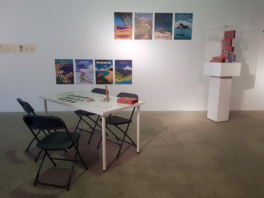
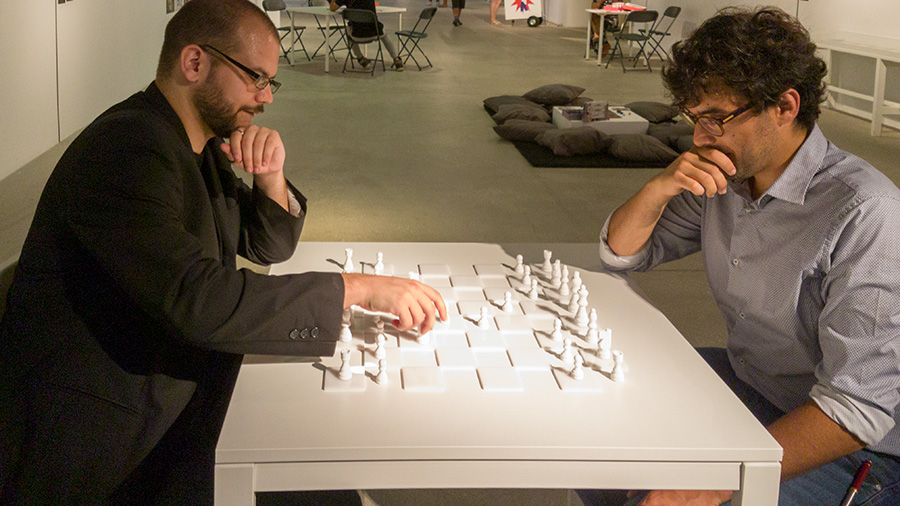
NEGOCIO at el Centro Cultural Las Cigarreras de Alicante is an ambitious attempt to present an archive of the creation of games as art largely over the last twenty years, though one work – “White Chess” by Yoko Ono dates back to 1966. The majority of works have been created in the 21st century. The exhibition presents a mix of digital and analog games and the vast majority of the exhibition is interactive – allowing visitors to play the games on exhibit as intended by the artists.
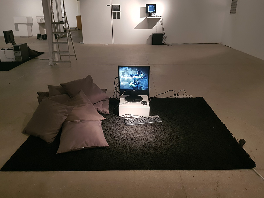
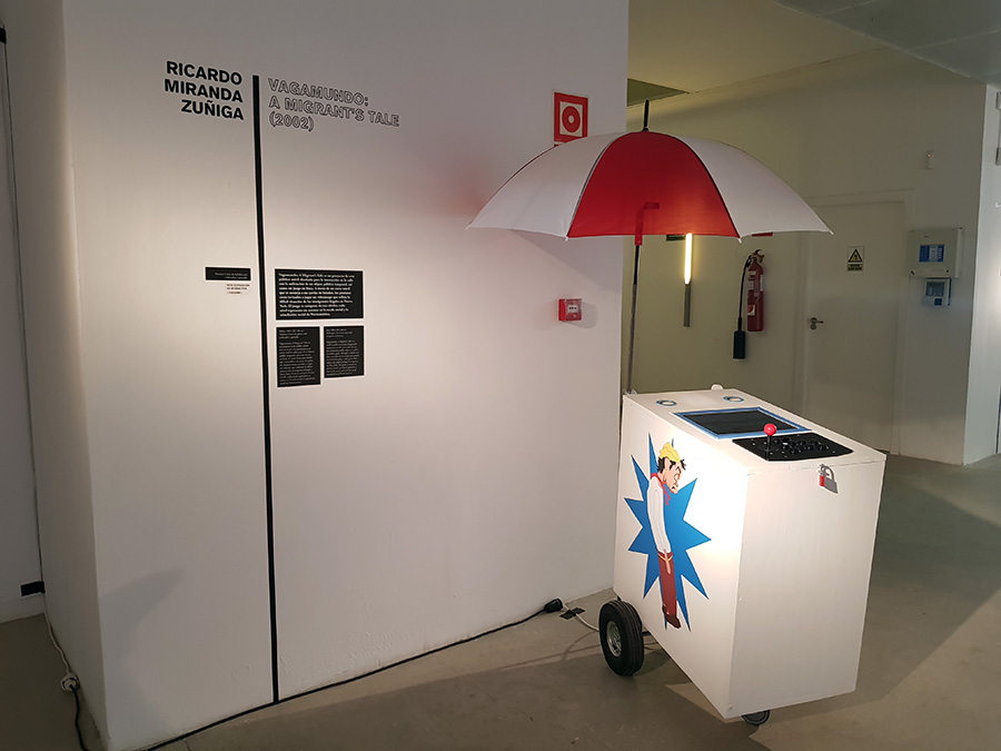
I’ve been honored with the inclusion of VAGAMUNDO: A Migrant’s Tale (2002) included the exhibition (pictured above). This is a sculpture and video game originally presented on the street that unfortunately is as timely today as 16 years ago due to the Trump administration’s stance regarding immigration.
The curators – David Machado Gutierrez, Alba Garcia Martinez, Beatriz Martinez-Villagrasa and Miguel Soria Andurell state:
The origin of the game, is lost in the memory of time; the game is perhaps as old as the very existence of the human being on earth. But what does the game transmit to us today apart from its playful appearance? Can art use it as a tool that reflects on challenges and social reality? Does it also work as an act of criticism? This exhibition does not pretend not to answer these questions, since it would be too ambitious, but it is formulated so that the spectator participates and, using the works of art as a guide. The exhibition investigates in the multiple planes what may unfolds in games as art.
Below are a selection of photographs documenting the exhibition.
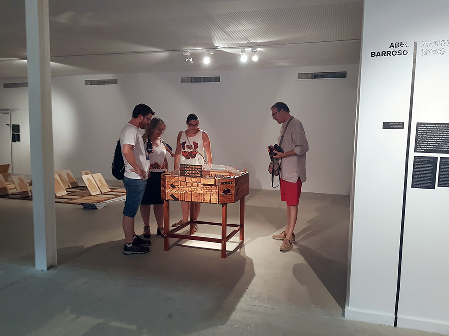
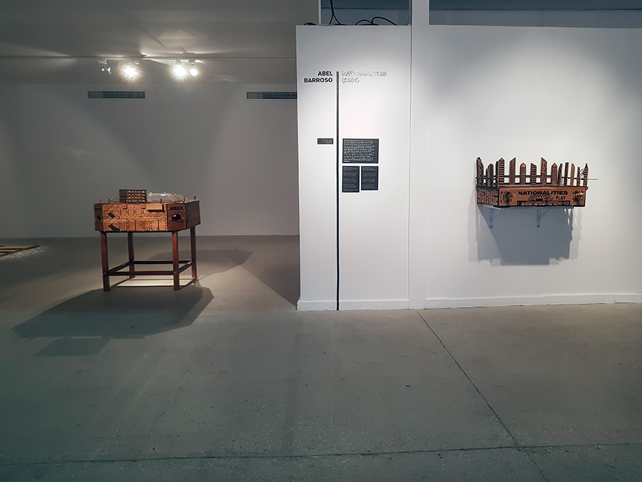
Two game sculptures by Cuban artist Abel Barroso
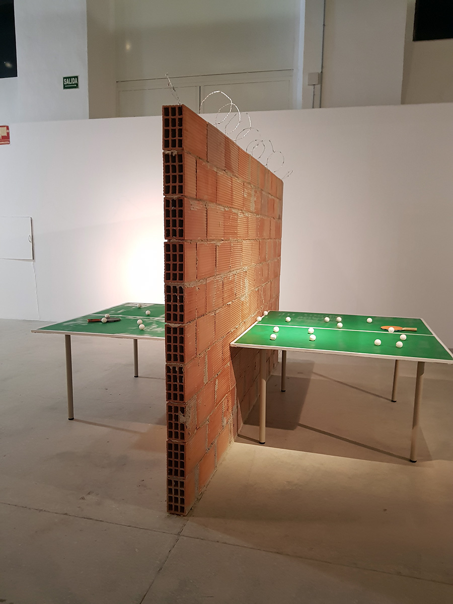
Carlos No’s Intifada – a “ping-pong table which, in place of a net, has been divided into two halves by a very high brick wall, topped by barbed wire that heightens a feeling of insurmountabilty. There arises in the spectator the curiosity of seeing the other side, the place which one is forbidden to see and be in, as if one had discovered Lewis Carrol’s charade in the passage to the other side of the looking-glass. In this wonderland that comprises this side and the other side, both the space and the visitor’s steps are divided into two.”
“Velvet-Strike is a mod of the first-person shooter video game Counter-Strike. The mod, developed by Anne-Marie Schleiner, Joan Leandre, and Brody Condon, adds “protest sprays” to the game’s existing graffiti function.”
“Ladrillazo is a historical game that takes you to the real estate bubble of the first decade of the 21st century. There were days of wine and roses, an interpretation center in each town, an airport in each city, mortgages at 40 years, masons with minister salaries, Olympic dreams, AVEs and golf resorts.”
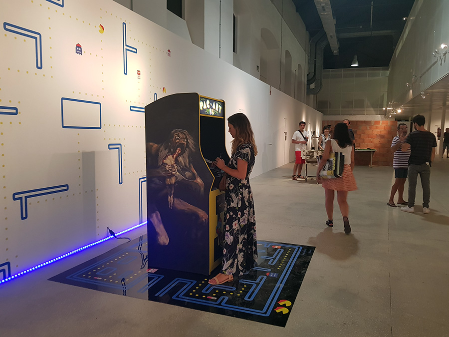
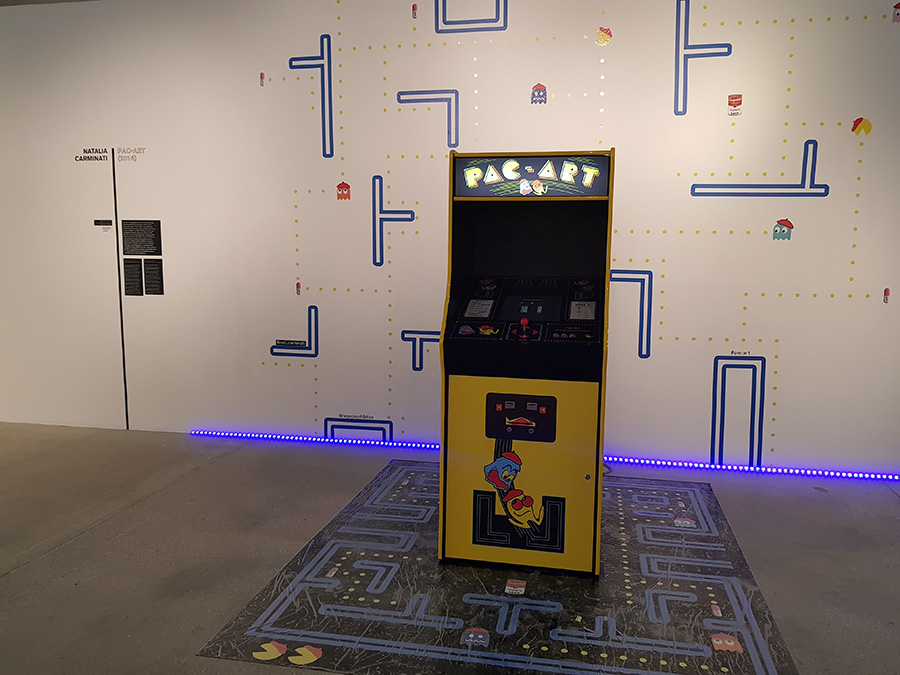
“Pac-Art is a version of the immensely popular Arcade video game Pac-Man. In this case, Pac-Art has transformed Pac-Man into an artist who has to devour famous works of art and flee from ghost-artists who threaten him.”
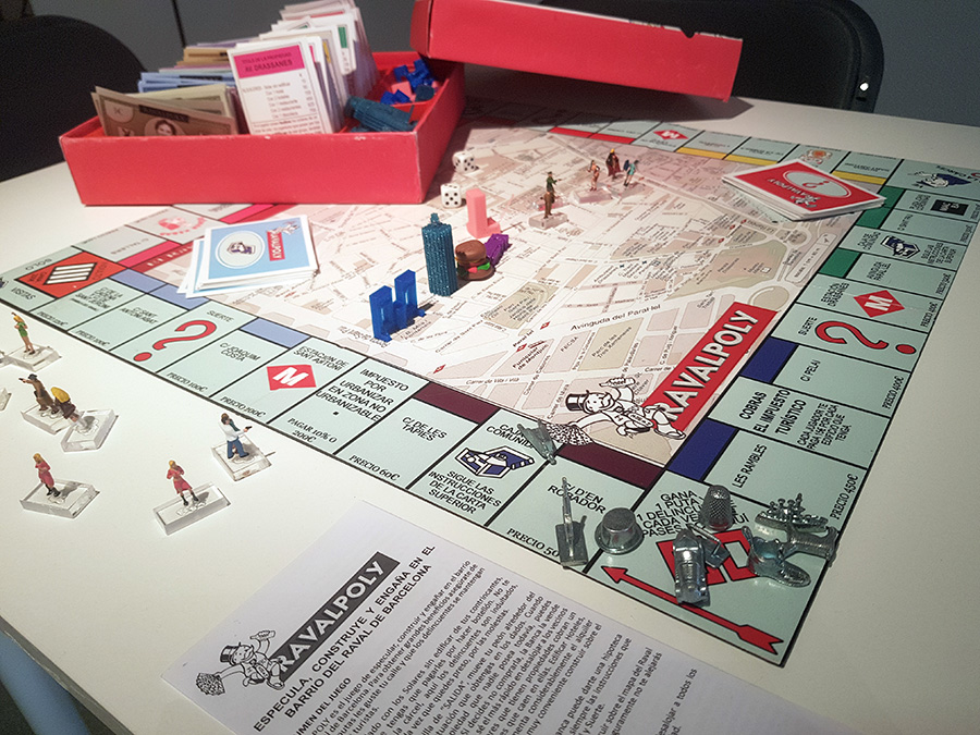
Ravalpoly by Alba Refulgente – a game of real estate speculation in Barcelona that re-contextualizes the game Monopoly.
Visitors will have the opportunity to play Yoko Ono’s “White Chess.”
Many other artists and game makers are included in this exhibition, including Brenda Romero, Connor Monahan, Molleindustria, Richard Hofmeier, Jason Rohrer, Joan Priego amongst others. And one more image of VAGAMUNDO:
How To Get The Best Screen Printing Results From Your Art Submissions
Custom t-shirts are more than just an excellent way to express yourself, they’re also incredible ways to get your artwork in the public space. Whichever you’re placing a custom order for, it’s important that your art or design comes out the way you want it to.
There’s nothing worse than seeing your work of art fail to translate to what you had in mind, which is where following this guide can help. Here’s how to get the best screen printing results from your art submission on sites like The TeeHive or Threadbird.
Using Vector
Vector based images and screen printing are a match made in t-shirt heaven. These files can be resized at any scale without losing an ounce of detail thanks to the mathematical equations surrounding their magnitude and direction. Even better, these images use both lines and curves.
When it comes to color assignment, vector is superbly clean. All you’ll need to create a vector image is a program like Corel Draw, Adobe Illustrator, or Inkscape.
Using Raster
Unlike vector images, raster uses pixels instead of lines. This makes using the correct DPI crucial from the get go, but it translates wonderfully to screen printing when done correctly. For reference, a web image looks stellar at 72 DPI while screen printing requires at least 300 to look decent.
While you might not be able to scale up with a raster image, you can create images at the same size they would be on the t-shirt. This gives you the ability to pay close attention to small details, which also helps in translation. Programs like Photoshop and Gimp utilize these types of images.
Screen Printing 101
The true secret to achieving a fine quality print is using highly defined artwork. That can be easier said than done, as many people find themselves with excellent art that simply isn’t ideal for screen printing.
Often times, individuals opt to do a test print first to make sure their design will translate like they want it to. While it’s always a good idea to test out a company’s quality first, test prints are often made using a different technique. Most of the time, companies will use a digital print or direct to garment printing.
The best way to make sure your art will look fantastic after the printing process is done is to contact the company you plan to work with. It isn’t uncommon for their artists to be able to recreate your image in a more screen print-friendly version. Always double-check to see if that comes with an extra cost, though.
Tips and Tricks
When uploading files to print, make sure they were created in the proper format beforehand. Simple saving something as a .pdf or .eps isn’t going to cut it when it comes to the quality you’re looking for.
Avoid using:
- .jpg
- .png
- Photographs
- Sketches
- Or anything with a low resolution
If you are dealing with hard copies of your artwork, it’s best to email the company you’re considering working with. Most have designers on hand that can work with you to ensure your work of art translates properly to the screen printing process. If you happen to live close by, it never hurts to drop in for an in-person chat.
Getting the Color Right
If your design is pre-made and ready to go, then all you’ll need to do is pick the color garment you think it would look best on. Try out different option to see what you like the most, and don’t be afraid to use multiple colored clothing items.
When designing from scratch, you have more ground work to do but a lot more room to play with. Simulate both ink and garment color combination by creating mock-ups first so your can proof the results before placing an order.
Most printing services use Pantone colors, but it’s important to keep in mind that the colors you’ve used in your vector or raster piece might become slightly off during the printing process. This happens because computer monitors vary widely in color, brightness and contrast.
What you see on your monitor might not be the same the printer sees on their screen. If you own a Pantone Solid Coated Formula Guide, then making a note of which shade you intended to use will solve this problem. If not, the printer will choose the closest available Pantone based on what they see.
Nailing the Best Prints
Getting the best screen print results for your artwork takes some time and dedication, but the above advice will help your work translate the best it possibly can. You’ll have a slew of awesome t-shirts ready to go before you know it!
This articles has been written by Ashley Lipman
New Castro Design
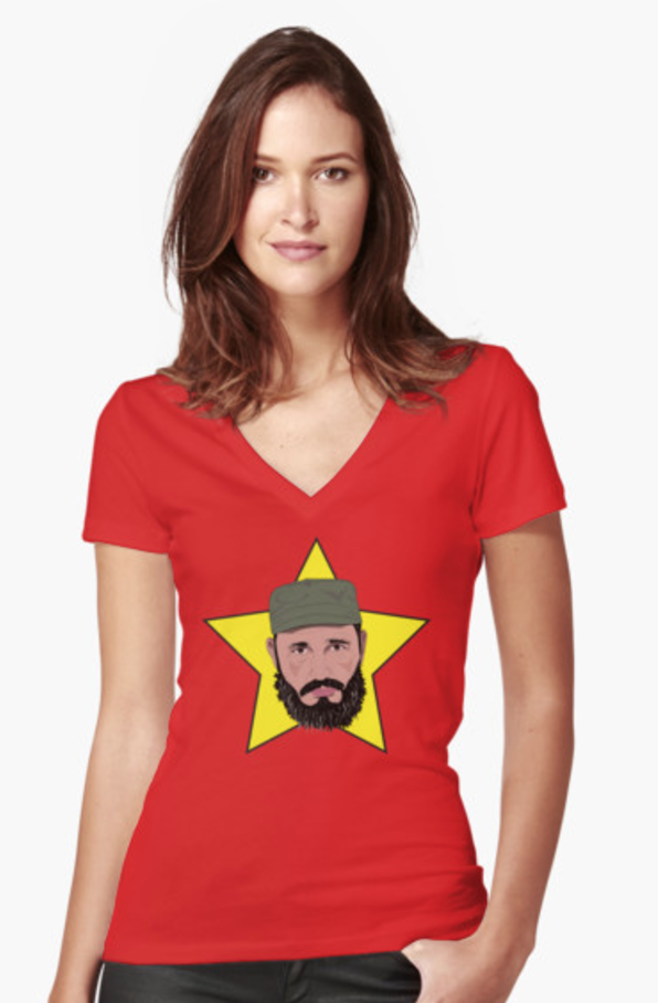
I’m ordering this t-shirt for myself.
So I export a lot of my illustrations or frames from my animations to images that can be printed onto various products from t-shirts to coffee mugs to stickers and I post them to RedBubble or Society6 or TeePublic. This design I really like and I partly do this because I want to wear some of the stuff that I draw, and this is such a case.