Archive for the ‘aesthetics’ Category
Reading: The Making of the Indebted Man (note 2)
Quotes from chapter 2 The Genealogy of Debt and the Debtor
For Nietzsche, making a memory for man being able “to have […] control over the future,” “to view the future as the present and anticipate it,” so that he is answerable for his own future.
Pg. 45
The Economy as Process of Subjectivation
It seems to me that my friends in cognitive capitalism are mistaken when they make “knowledge” the origin of valorization and exploitation. There is nothing new in the fact that science, skills, and technological and organizational innovations represent the productive forces of capital – Marx already understood as much in the mid-19th century.
What is required and cuts across the economy and modern-day society, is not knowledge but the injunction to become an economic “subject” (“human capital,” “entrepreneur of the self”), an injunction that concerns just as much the unemployed as the user of public services, the consumer, the most “modest” of workers, the poorest, or the “migrant.”
Pg. 50-51
If capitalists spend little time worrying about investing in a more than improbable – always heralded but never realized – “knowledge society,” they are, on the other hand, cruelly inflexible when forcing the governed to take on all the economic risks and damage the capitalists themselves have created.
Pg. 52
The Two Marxes
A Very Nietzschean Marx
But this abolition of estrangement, this return of man to himself and therefore to other men is only an appearance; the self-estrangement, the dehumanization, is all the more infamous and extreme because its element is no longer commodity, metal, paper, but man’s moral existence, man’s social existence, the inmost depths of his heart, and because under the appearance of man’s trust in man it is the height of distrust and complete estrangement.
Pg. 56
The trust that credit exploits has nothing to do with the belief in new possibilities in life and, thus, in some noble sentiment toward oneself, others, and the world. It is limited to a trust in solvency and makes solvency the content and measure of the ethical relationship.
Pg. 58
In its financial form, capital accumulated in banks appears as “capital in general,” a simple abstraction. But it is a powerful abstraction, since capital emerges as “autonomous value,” “independent” of its actualization in a particular sphere; it exists as an “undifferentiated” force capable of every form of actualization. It thus appears as the power to prescribe and anticipate future value, as a power of destruction/creation.
Pg. 63
- These brings to mind Robinhood’s recent offer to “sweep in” uninvested money sitting in my account so that it can earn interest. Robinhood has partnered with banks to play with people’s money and make more money…
The concentration of capital and the growth of their turnover is radically changing the significance of the banks. Scattered capitalists are transformed into a single collective. The “coherence” and strategies are those of the M-Mlogic, which by making money from money also reveals its “irrationality.” The latter materializes in every “liberal” period and leads almost automatically to the most sever crises, each time clearing the way for authoritarian politics (which happened with the First World War and fascism.)
Pg. 65
“We live forward but think backward” – William James. To live forward means “to believe in the world and in the new possibilities of life” it encompasses, says Deleuze. Faith and trust are a force – joyous and confident – that gives one a “generous strength.”
Pg. 69
…In order to realize the power to act, we need to believe (trust) in the “moving present,” the present as possibility, that is, in the world and the new possibilities of life that it holds. The power to act is subordinate to an existential affirmation, to a “yes” that expresses a self-positioning. It presupposes hope and faith, anticipating what has not yet come to pass, making the impossible possible.
Pg. 71
For finance, the future is a mere forecast of current domination and exploitation. But if a critical threshold of uncertainty with regard to future of exploitation and domination is passed, the present, emptied of its possibilities, collapses. The crisis is then a crisis of time from which emerges a time of political and social creation, which finance can only endeavor to destroy. This is exactly our present situation. The logic of debt is stifling our possibilities for action.
Pg. 71
The pain of a debtor is interiorized, responsibility for the debt becomes a feeling of guilt. Pg. 78
From the far reaches of the empire the Vikings with their ships and the Hungarians with their horses (mobility, migratory, nomadic, and warrior flows whose power was greater than the peasants’) descended, pillaging villages, tombs and monasteries… they made economic investments through destruction… The less mobile flow (the peasants) became subordinate to the nomadic and mobile flow (the barbarian warriors). The “barbarian flows were deterritorialized as well as deterritorializing.”
Pg. 82
- Today, young professionals who are considered ambitious move about the globe, hopping from opportunity to better opportunity. They are deterritorialize and deterritorializing by their disinterest in establishing or maintaining roots and building community. They leave small towns to the university and then the metropolis. Major cities are populated by transient citizens. Meanwhile the small cities and towns are abandoned, ghost towns populated by senior citizens.
The flow of financing that is, money is capital, is a mutant power, a creative flow, a set of “sign powers,” because it engages the future, manifests a force of prescription, and constitutes a power of destruction/creation that anticipates that which is not yet present. Financing flows are a deterritorialized and deterritorializing power, a power that does not emerge after the economic, but is imminent to it. They affect possibilities and their actualization.
The substance of money is capital is time, but less labor time than time is the possibility of choice, decision, and control, in other words, the power to destroy/create social forms of exploitation and subjection.
Pg. 85
Pope.L Bougie Irreverence
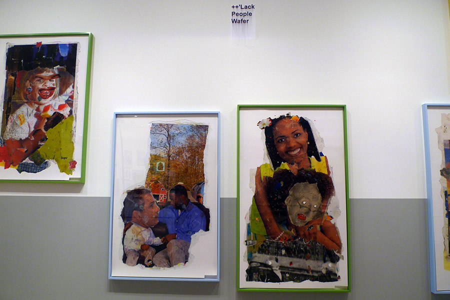
It is difficult to call any art placed in a blue chip Chelsea gallery irreverent, but Pope.L tries his best. Currently (9/13 – 10/27 2018) at Mitchell-Innes & Nash, Pope.L “One Thing After Another (Part Two)” stocks the gallery with collaged digital prints, framed found trash, assemblage, photo-collage, and a video of an erect penis attempting to balance a white whip cream pie. (As you might guess, the cream pie tips off the big, hard, black dick; only Brett Kavanaugh’s small white penis would hold that pie up.) The video is hilarious and I wish I had recorded a bit of it to include it here. It is a sharp and whimsical comment on desire, sex, race and privilege or rather lack of. The white pie and black dick are accompanied by a smoking digital black sock puppet that rises and forms like a snake from a corner of the video image.
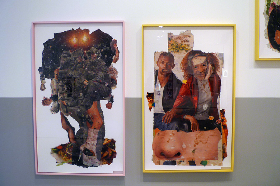
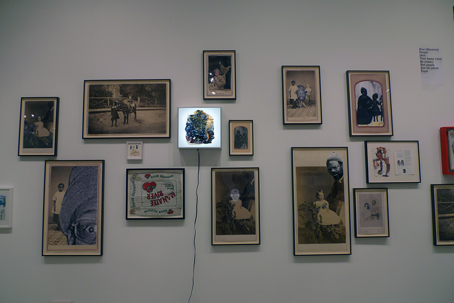
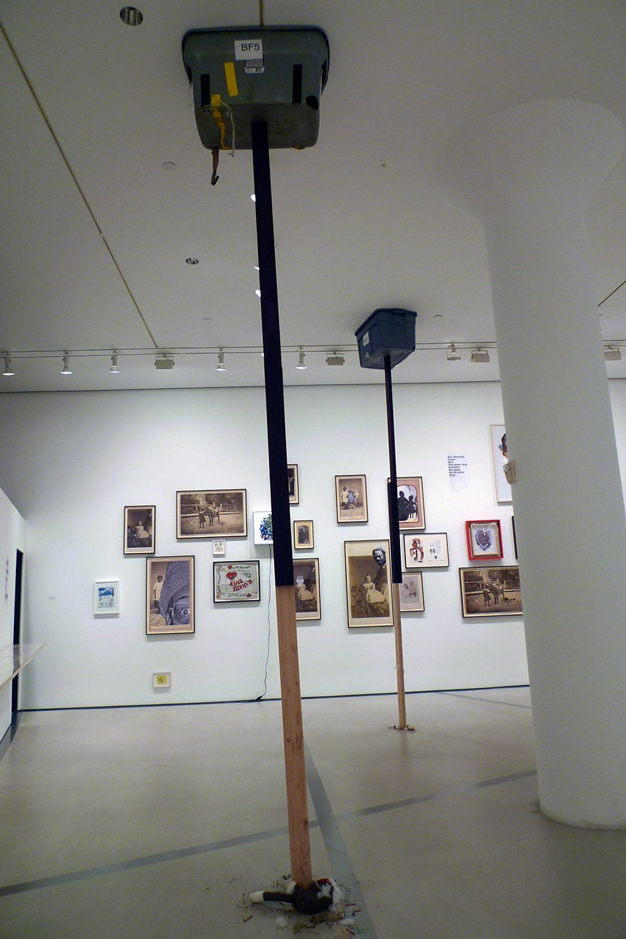
The digitally printed collages tear apart political and celebrity figures, mockingly reframing them in unexpected contexts and pairings. Across the gallery, William Pope.L has inserted himself into historical photographs. Again, the visuals are at once comical and critical recontexualizing a problematic racial history of the United States.
Pope.L effectively reminds us to always look at the images we are fed with a critical eye. Question the images – where are they coming from, why are they being presented and what is it that they represent? What is our place in this culture? But in the end, lets not take ourselves too seriously, be creative, have fun, but always be smart.
NEGOCIO at Centro Cultural Las Cigarreras de Alicante
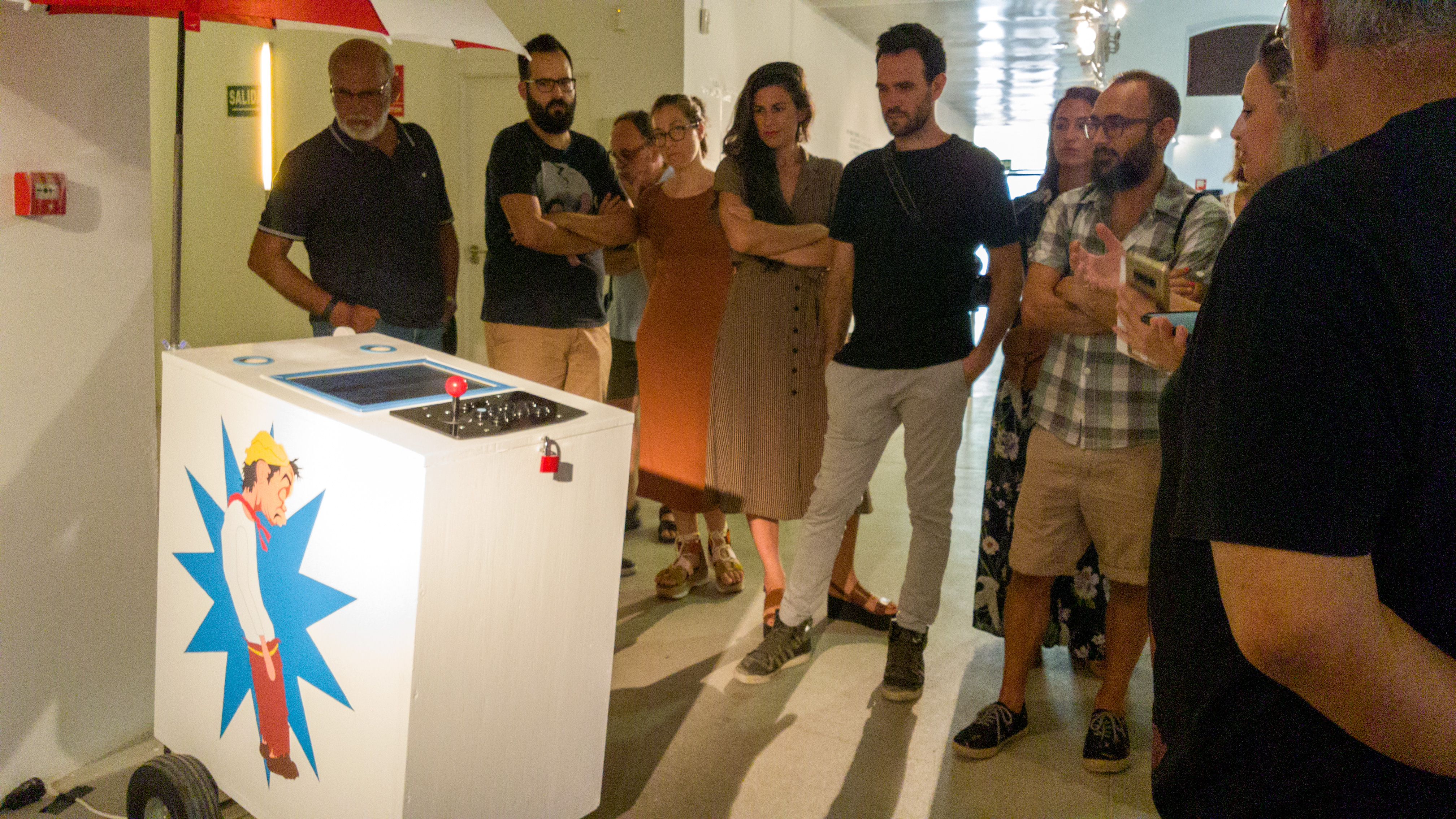
NEGOCIO at el Centro Cultural Las Cigarreras de Alicante is an ambitious attempt to present an archive of the creation of games as art largely over the last twenty years, though one work – “White Chess” by Yoko Ono dates back to 1966. The majority of works have been created in the 21st century. The exhibition presents a mix of digital and analog games and the vast majority of the exhibition is interactive – allowing visitors to play the games on exhibit as intended by the artists.
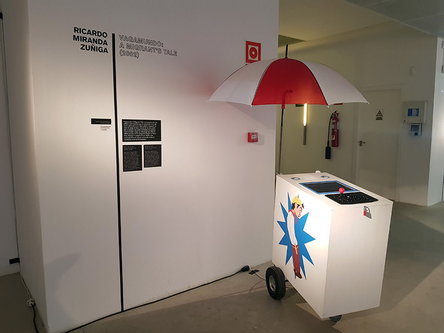
I’ve been honored with the inclusion of VAGAMUNDO: A Migrant’s Tale (2002) included the exhibition (pictured above). This is a sculpture and video game originally presented on the street that unfortunately is as timely today as 16 years ago due to the Trump administration’s stance regarding immigration.
The curators – David Machado Gutierrez, Alba Garcia Martinez, Beatriz Martinez-Villagrasa and Miguel Soria Andurell state:
The origin of the game, is lost in the memory of time; the game is perhaps as old as the very existence of the human being on earth. But what does the game transmit to us today apart from its playful appearance? Can art use it as a tool that reflects on challenges and social reality? Does it also work as an act of criticism? This exhibition does not pretend not to answer these questions, since it would be too ambitious, but it is formulated so that the spectator participates and, using the works of art as a guide. The exhibition investigates in the multiple planes what may unfolds in games as art.
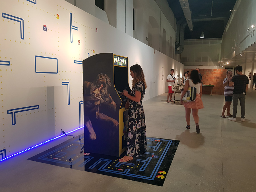
Below are a selection of photographs documenting the exhibition.
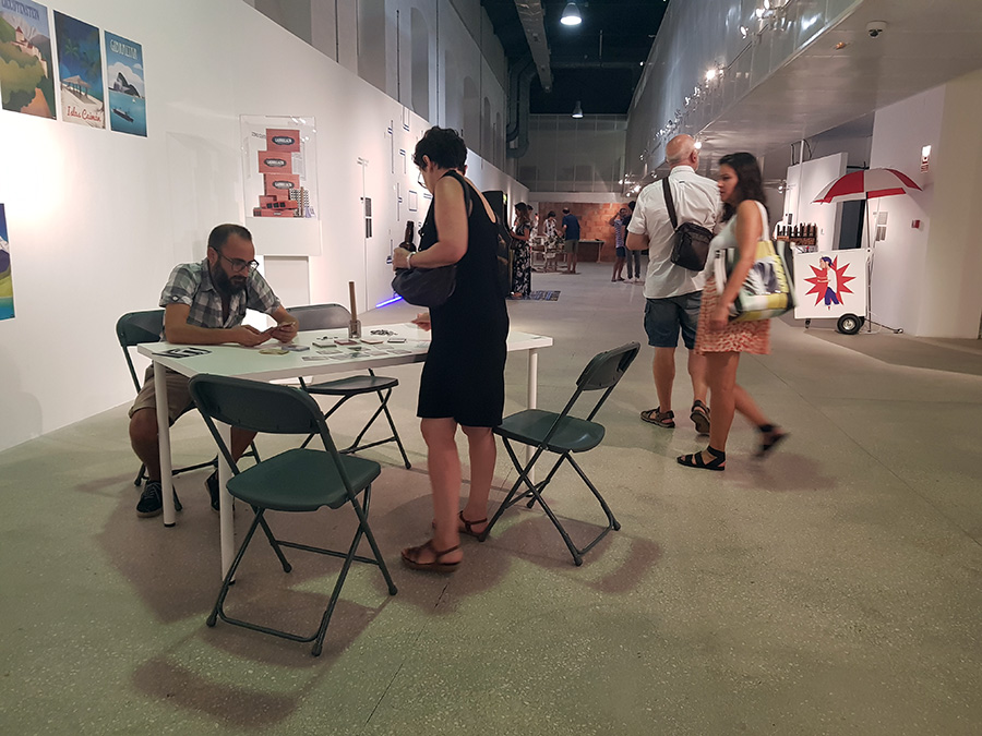
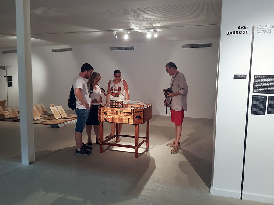
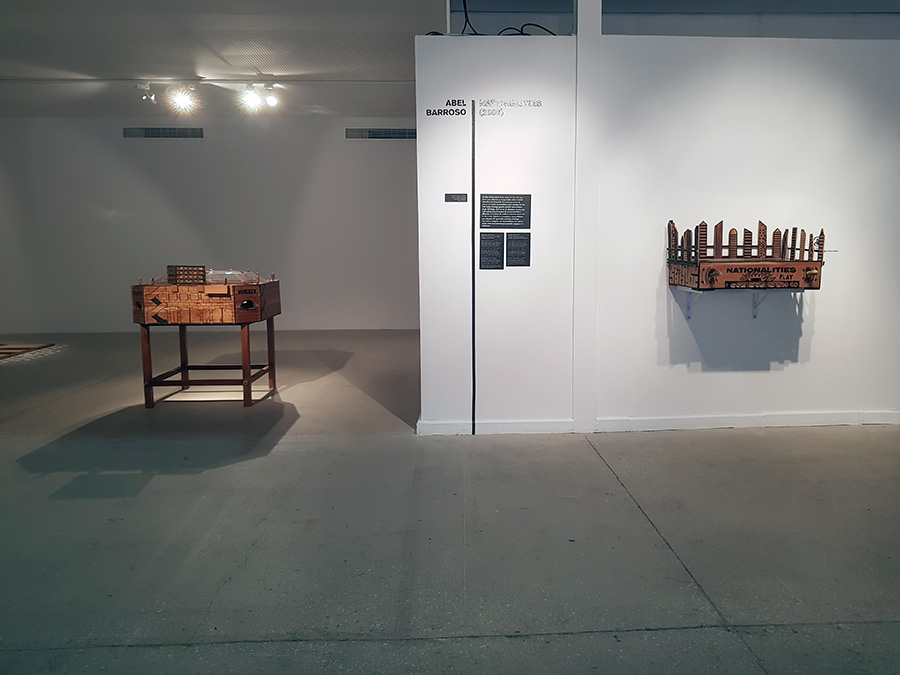
Two game sculptures by Cuban artist Abel Barroso
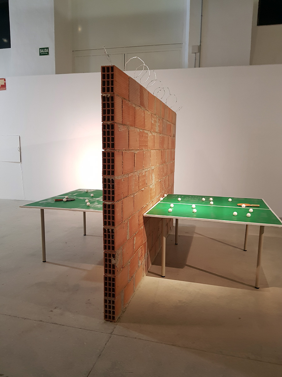
Carlos No’s Intifada – a “ping-pong table which, in place of a net, has been divided into two halves by a very high brick wall, topped by barbed wire that heightens a feeling of insurmountabilty. There arises in the spectator the curiosity of seeing the other side, the place which one is forbidden to see and be in, as if one had discovered Lewis Carrol’s charade in the passage to the other side of the looking-glass. In this wonderland that comprises this side and the other side, both the space and the visitor’s steps are divided into two.”
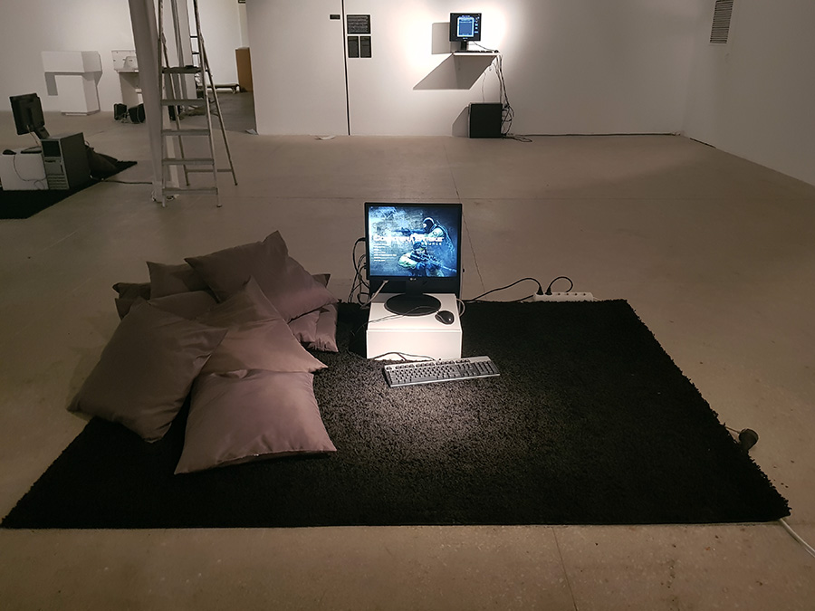
“Velvet-Strike is a mod of the first-person shooter video game Counter-Strike. The mod, developed by Anne-Marie Schleiner, Joan Leandre, and Brody Condon, adds “protest sprays” to the game’s existing graffiti function.”
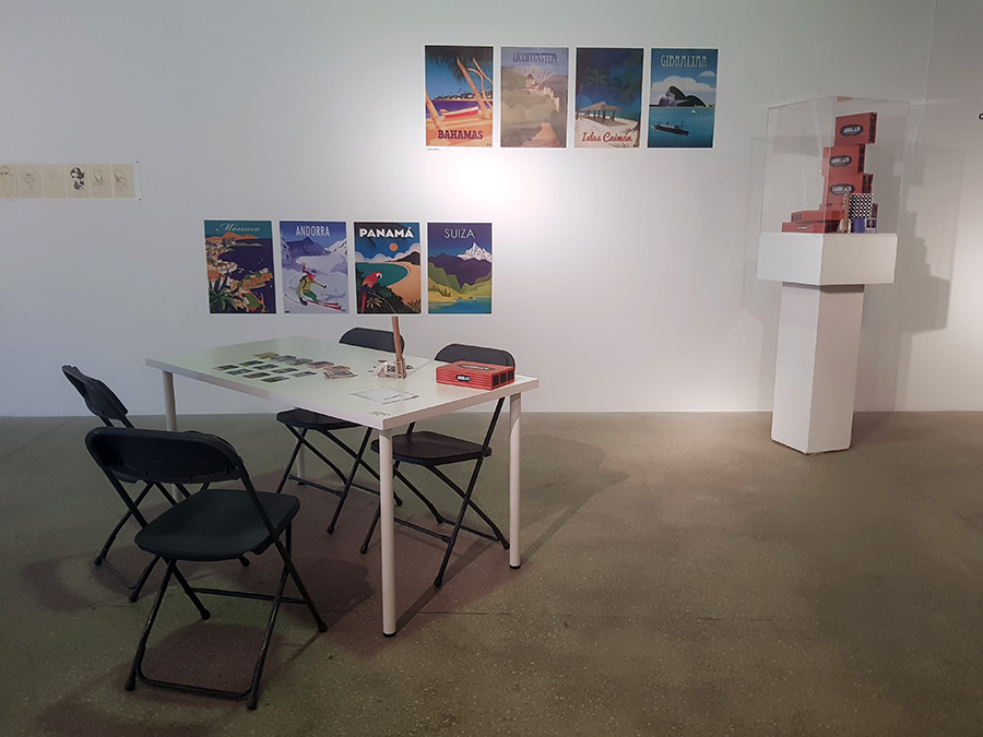
“Ladrillazo is a historical game that takes you to the real estate bubble of the first decade of the 21st century. There were days of wine and roses, an interpretation center in each town, an airport in each city, mortgages at 40 years, masons with minister salaries, Olympic dreams, AVEs and golf resorts.”
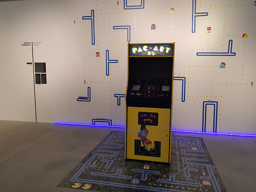
“Pac-Art is a version of the immensely popular Arcade video game Pac-Man. In this case, Pac-Art has transformed Pac-Man into an artist who has to devour famous works of art and flee from ghost-artists who threaten him.”
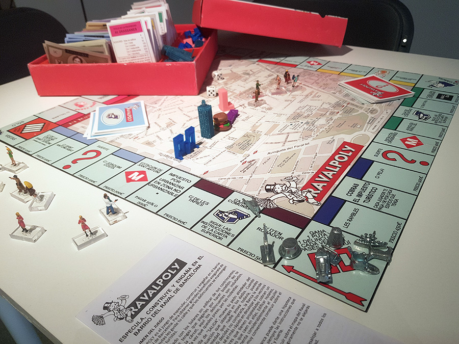
Ravalpoly by Alba Refulgente – a game of real estate speculation in Barcelona that re-contextualizes the game Monopoly.
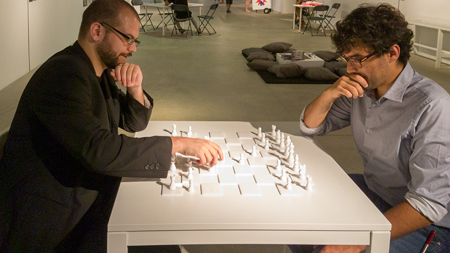
Visitors will have the opportunity to play Yoko Ono’s “White Chess.”
Many other artists and game makers are included in this exhibition, including Brenda Romero, Connor Monahan, Molleindustria, Richard Hofmeier, Jason Rohrer, Joan Priego amongst others. And one more image of VAGAMUNDO:
From Minecraft to Fortnite: The Common Language of Video Games
I grew up between the United States and Nicaragua – the school year in the U.S. and summers in Nicaragua. In the 80s, I would bring my cousins packs of blank tapes and a selection of my favorite tapes so that we could make mix tapes. I would also bring old toys, such as my Intellivision game system with all it’s games (where it got an extra 6+ years of play).
I recall one summer leaving The Who’s “The Kids Are All Right” tape because one of my younger cousins – Oscar absolutely loved it. When I returned the next summer, Oscar could sin every song on that tape perfectly. I was floored! Oscar was young as he was born in 1976 and this is the mid 80s – sometime between 1984 and 1987, so at most he was 11 years old (I am five years older than Oscar). He had never taken an English class and yet, there he was signing perfect renditions of “My Generation,” “Happy Jack” and “Pinball Wizard“. Oscar has never lived in an English speaking country and he never attended an English speaking school, however today his English is amongst the strongest of those cousins who have remained in Nicaragua. For nearly a century now, popular culture has been a bridge amongst people divided by distance. Oscar and I continued for years asking one another what we are listening to and playing upon seeing each other. Music and video games are a common language that we share.
In 2015, I travelled to Nicaragua with my 7 year old – Iggy as my mom wanted to spend Christmas and New Years in her native country amongst her siblings. I have spoken in Spanish to Iggy since day one, but I have not forced him to use it – a big mistake. He understands Spanish very well, but he is not comfortable speaking it. Although Iggy has many second cousins in Nicaragua who are bilingual, the one cousin that is the same age, does not attend a bilingual school and does not speak English, so I wondered how they would get along. Of course, they are kids and speak the universal language of play, so after a brief awkward period of silence and observation they engage. They both play soccer and and are competitive about it. The ball and the grass were instantly a common space as was a mutual admiration for Messi, Barcelona and La Liga.
Tired and sweaty they sought reprieve from the sun indoors where I discovered another common space – Minecraft. This I did not expect. I knew that Minecraft was huge amongst 7 year olds in the States, but I did not consider its global reach. Once I set my kid’s device to my cousin’s wifi, it only took them a minute to start playing together on a local area network. And there they were, sitting next to one another, interfacing through a screen, laughing, teaching each other skills, trading devices, building structures, killing zombies and doing whatever else one does in Minecraft. Eventually, they needed to be cut off, but common languages and happy bonds were established.
A couple weeks later, we all went to see “The Force Awakens” and another common bond was established. As the boys went on and on about the movie, my cousin and I recalled our mutual love for “Return of the Jedi” – another soundtrack that I had left with him back in the early 80s. We both loved that celebratory Ewok “Yub Nub” song!
It is summer 2018 and due to the murders committed by Ortega and his regime following April protests against the pilfering of Nicaragua’s social security by the Ortegas, many of my cousins’ kids are States-side. Once again my son Iggy, now 10 years old was about to meet two cousins who do not speak English – the twins Franco and Diego who are 12 years old. And again, I wondered how they’d communicate and get along. A brief awkward period of observation and listening soon became play.
My son had just received a drone from his grandmother for his birthday. He pulled it out, walked his cousins through the interface and they took turns flying the drone around the living room. As the adults sat at the table in conversation, the twins’ mother lamented about how many hours she allows them to play video games as she doesn’t have a car or is comfortable using public transportation. Then Franco chimed in on how much they love Fortnite and immediately Iggy started telling them about what level he’s at, his favorite weapons, number of kills and favorite dances… Soon the three were sharing two devices and playing as a team. And yes, they needed to be cut off and pulled away from the devices, but the ice was broken and they spent the rest of the day playing and interacting device free.
It’s been over 35 years since I taught my cousins how to use the Intellivision controllers and play games like Pitfall, Nightstalker and Utopia. Today the interfaces are much more intuitive and it’s pointless to make any comparison regarding the graphics, but video games are a global language amongst children and it’s always surprising to me how some titles cross all cultural differences to establish common environments of virtual play and exchange.
RAMMELLZEE: Racing for Thunder
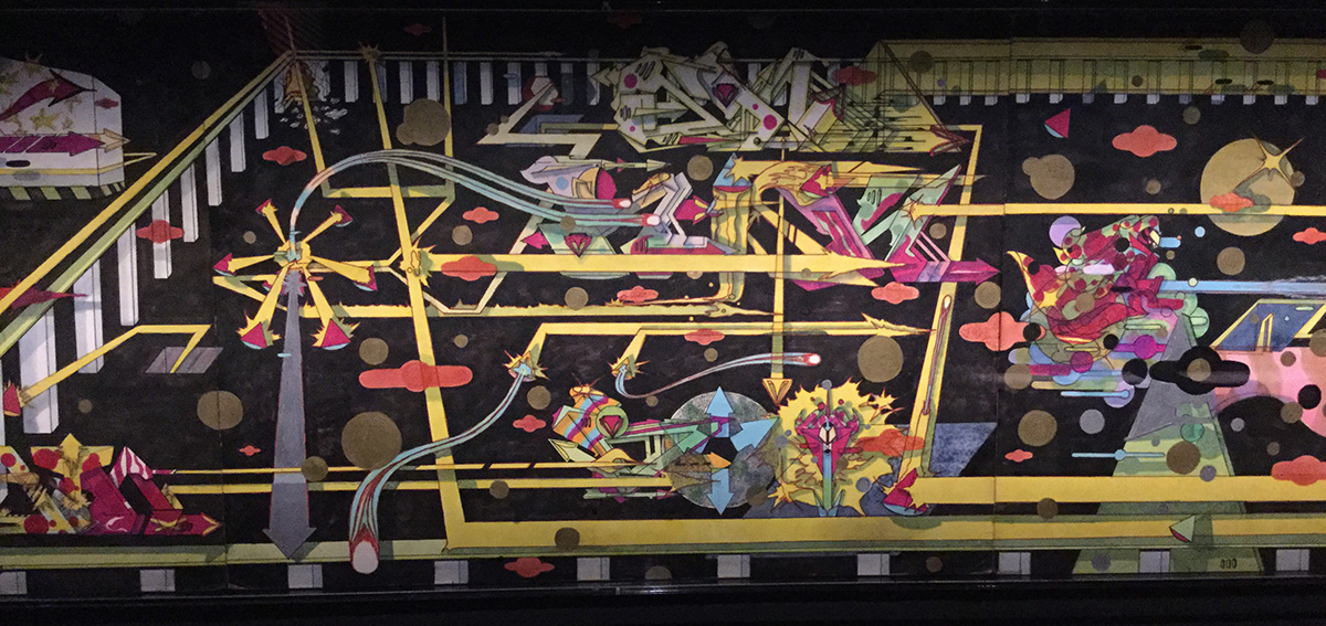
“RAMMELLZEE: Racing for Thunder” at Red Bulls Arts New York opens with sketches for the artist’s graffiti pieces. The drawings immediately bring to mind images of subway cars from the late 70s covered with graffiti. And some visitors may as well recall their own sketch books from the 70s and 80s filled with tags and letter designs for possible pieces to be realized on the street. These early works are the strongest 2D work by Rammellzee that are included in the two-floor exhibition.
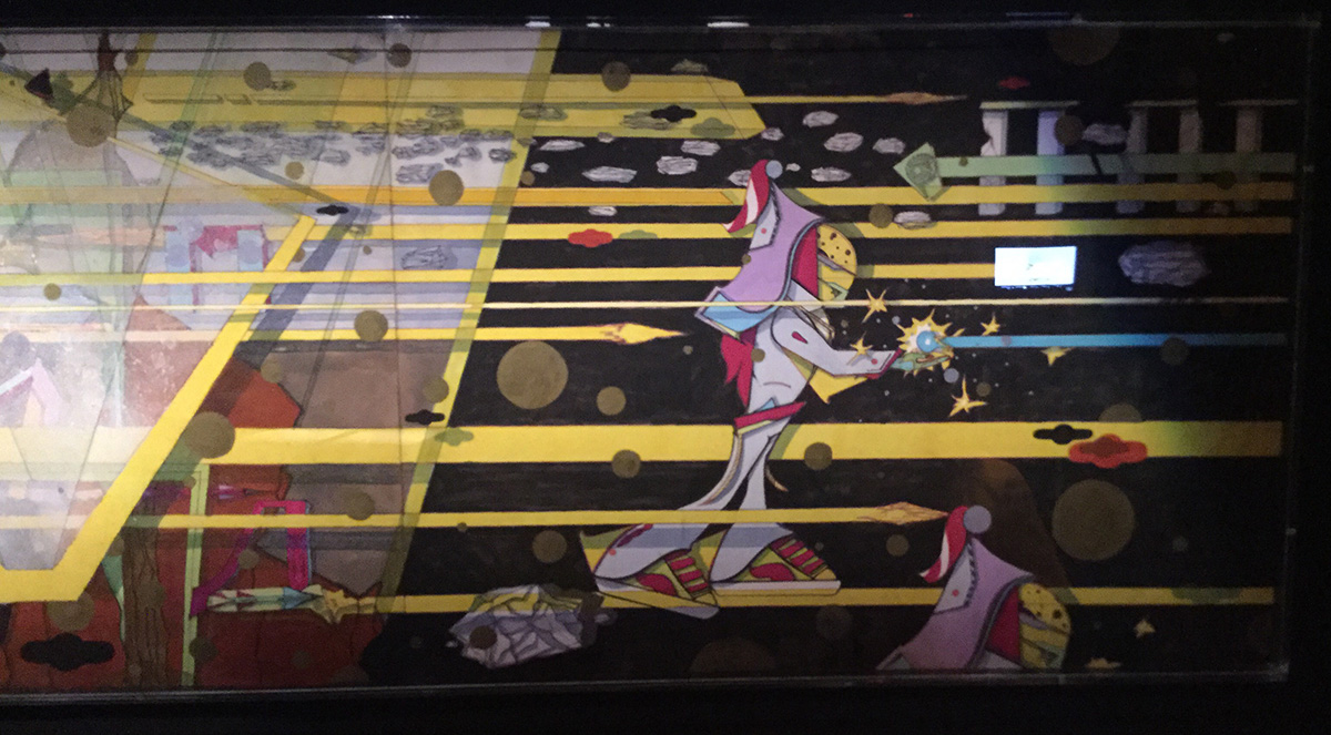
As one continues through a dark tunnel lined with early 2D works and iPad slideshows accompanied by audio recordings by celebrities, one will enter a screening room. Projected across bleachers are an assortment of video sequences capturing the artist rapping, lecturing, performing. One video capturing Rammellzee rapping from his Beat Bop classic at a club includes drawings, text and animation by Jean-Michel Basquiat superimposed over the performer. You can see the video here Rammellzee, Toxic C1 and Basquiat Live at the Rhythm Lounge 1983. There is also a sequence from Charlie Ahearn’s 1982 “Wild Style” featuring Rammallzee performing on stage. Perhaps amongst the most entertaining sequences are Rammallzee performing as a Garbage God in outlandish costume to Northern European gallery goers who complain to watch his back as he makes his way through the small crowded gallery. Also entertaining (for short bits) are his lectures to perhaps student audiences to his exhibitions, also costumed as a Garbage God and at one point shooting fire from his mouth (which was awesome to watch and hear the gasps from the live witnesses).
Proceeding beyond the screening room, one enters a large gallery with primarily 2D pieces. These works are spray painted works, epoxy frescos, assemblage wall pieces combining found objects, spray paint splashes and loads of resin. Some works feature space ships flying through spay paint environments. For the most part these works seem uninspired and more like 80s bad art.

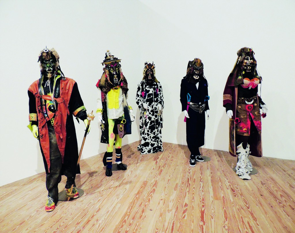
By far the best work are the Garbage Gods and Letter Racers in the downstairs. Unfortunately, Red Bulls Arts decided to attempt to re-create the sensibility one may imagine from Rammellzee’s Tribeca loft – Battle Station by using black light. However, this isn’t the famed Battle Station – playground of the artist; this is a fancy art gallery and the black light is unnecessary. The black light makes it difficult to fully appreciate the Garbage Gods costumes that Rammellzee would perform in or the small figures that he created. As someone hoping to fully appreciate this inspired, meticulous work, skip the black light and allow us to carefully study these works. I would have preferred to see these works in this lighting:

In considering this exhibition, I came upon this excellent NY Times 2012 article on Rammellzee that is worth a read, if interested in his work and life. However, if you have a free couple of hours, “RAMMELLZEE: Racing for Thunder” exhibition is a great way to intimately learn about the artist directly through his voice from hours of archival material. Amongst the 2D paintings on the top floor, there is a small listening booth with extended interviews with the artist discussing his life and philosophy. There are also videos with Rammellzee working in the studio, discussing his ridiculously toxic practice as you watch him pouring gallons of resin and spray painting indoors without a mask. Red Bull Arts has done an amazing job of creating a rich portrait of the artist.
Northeast Exhibitions Editor for caa.reviews
Over the past year, I have been working as the Northeast Exhibitions Editor for caa.reviews and thus far it’s been a great experience! Fortunately, my job is relatively easy or perhaps better stated fun. I search out exhibitions that deserve to be reviewed throughout the Northeast (but not including NYC). As I find, important exhibitions, I then need to identify potential reviewers. I had heard that commissioning non-paid reviews from people was difficult, but thus far, I’ve been able to quickly find writers or have people even volunteer reviews for exhibitions that they felt passionate about.
Once the writer and I agree on a deadline, we bounce the review back to one another to arrive at the final product. It has been a great learning experience to envision exhibitions that I have not visited myself through the writing of the reviewer. And as editor to work with the reviewer to create a clear sense of the exhibition and its power for readers who may as well not have the opportunity to see the exhibition first hand.
Thus far, I have had the pleasure to work with the following writers:
Valeria Federici on “Art in the Age of the Internet, 1989 to Today” at the ICA Boston.
Christopher Kasprzak who reviewed “Calder: Hypermobility,” at the Whitney Museum of American Art.
Ellen Handy who wrote an excellent review on “Clarence H. White and His World: The Art and Craft of Photography, 1895–1925” at Princeton University Art Museum.
John Muse on “Yoonmi Nam: Still” at Philadelphia’s Print Center.
There is more coming soon!
Zach Blas Contra-Internet at Art in General
Contra-Internet: Jubilee 2033 trailer from Zach Blas on Vimeo.
I had been looking forward to seeing Zach Blas’s Contra-Internet exhibition at Art in General, unfortunately it was not as engaging as I had hoped. The exhibition presents one single channel video installation that features the nearly 30 minute film “Jubilee 2033” and three other single-channel video works on monitors. The three video works on monitors present ideas and research regarding the internet – the hegemonic network of today and for the foreseeable future – through computer screen recordings by Blas. (I really hope that artists stop using screen-recordings of themselves clicking through files as a medium; it’s seldom interesting.)
Although I was disappointed by the exhibition, the gravity dance performance by Cassils as Nootropix, “a contra-sexual, contra internet prophet” is captivating an entirely worth the trip. The premise of the film is funny as it opens with Ayn Rand discussing the future of her ideas with two of her followers – Alan Greenspan and a fictional character Joan Mitchell. A young Greenspan proposes that the group take an acid trip. I was turned off by the highly accented performance of Rand and her cult, so I was glad to see them drop liquid acid.
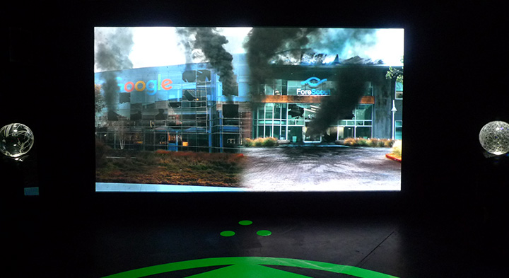
As the trip begins, an internet connected artificial intelligence in the form of a manga character appears and takes them in to the future. The future is of course dystopian as the present reality burns and it’s certainly fun seeing the Google headquarters burning along with other tech companies in the not so distant future of 2033.
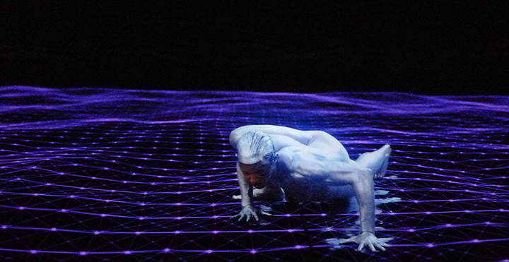
Along their travels, we encounter tech workers being taken hostage by “The Art Professor” wearing gray, paint-splattered coveralls and wielding a machine gun. Later in a classroom, the Art Professor introduces Nootropix (Cassils) who in their monologue states that they will perform the creation of gravity. The performance artist is powerful and their dance upon a purple matrix while dawning a large, erect, glowing CGI penis that is constantly spewing black liquid is awesome. The dance is mesmerizing and triumphant.
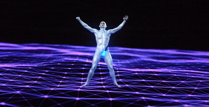
In Nootropix, Blas presents one of his contra-internet exotic creatures “to discover or create a world of network difference.” I could have entirely skipped the storyline, and merely be fantastically transported by Cassils’s character and performance as I think that it would have left me asking more questions and appreciating the mystery. We know that a network of difference is not plausible, so why not create the fantastic and shed the tedious philosophizing.
How To Get The Best Screen Printing Results From Your Art Submissions
Custom t-shirts are more than just an excellent way to express yourself, they’re also incredible ways to get your artwork in the public space. Whichever you’re placing a custom order for, it’s important that your art or design comes out the way you want it to.

There’s nothing worse than seeing your work of art fail to translate to what you had in mind, which is where following this guide can help. Here’s how to get the best screen printing results from your art submission on sites like The TeeHive or Threadbird.
Using Vector
Vector based images and screen printing are a match made in t-shirt heaven. These files can be resized at any scale without losing an ounce of detail thanks to the mathematical equations surrounding their magnitude and direction. Even better, these images use both lines and curves.
When it comes to color assignment, vector is superbly clean. All you’ll need to create a vector image is a program like Corel Draw, Adobe Illustrator, or Inkscape.
Using Raster
Unlike vector images, raster uses pixels instead of lines. This makes using the correct DPI crucial from the get go, but it translates wonderfully to screen printing when done correctly. For reference, a web image looks stellar at 72 DPI while screen printing requires at least 300 to look decent.
While you might not be able to scale up with a raster image, you can create images at the same size they would be on the t-shirt. This gives you the ability to pay close attention to small details, which also helps in translation. Programs like Photoshop and Gimp utilize these types of images.

Screen Printing 101
The true secret to achieving a fine quality print is using highly defined artwork. That can be easier said than done, as many people find themselves with excellent art that simply isn’t ideal for screen printing.
Often times, individuals opt to do a test print first to make sure their design will translate like they want it to. While it’s always a good idea to test out a company’s quality first, test prints are often made using a different technique. Most of the time, companies will use a digital print or direct to garment printing.
The best way to make sure your art will look fantastic after the printing process is done is to contact the company you plan to work with. It isn’t uncommon for their artists to be able to recreate your image in a more screen print-friendly version. Always double-check to see if that comes with an extra cost, though.
Tips and Tricks
When uploading files to print, make sure they were created in the proper format beforehand. Simple saving something as a .pdf or .eps isn’t going to cut it when it comes to the quality you’re looking for.
Avoid using:
- .jpg
- .png
- Photographs
- Sketches
- Or anything with a low resolution
If you are dealing with hard copies of your artwork, it’s best to email the company you’re considering working with. Most have designers on hand that can work with you to ensure your work of art translates properly to the screen printing process. If you happen to live close by, it never hurts to drop in for an in-person chat.
Getting the Color Right
If your design is pre-made and ready to go, then all you’ll need to do is pick the color garment you think it would look best on. Try out different option to see what you like the most, and don’t be afraid to use multiple colored clothing items.
When designing from scratch, you have more ground work to do but a lot more room to play with. Simulate both ink and garment color combination by creating mock-ups first so your can proof the results before placing an order.

Most printing services use Pantone colors, but it’s important to keep in mind that the colors you’ve used in your vector or raster piece might become slightly off during the printing process. This happens because computer monitors vary widely in color, brightness and contrast.
What you see on your monitor might not be the same the printer sees on their screen. If you own a Pantone Solid Coated Formula Guide, then making a note of which shade you intended to use will solve this problem. If not, the printer will choose the closest available Pantone based on what they see.
Nailing the Best Prints
Getting the best screen print results for your artwork takes some time and dedication, but the above advice will help your work translate the best it possibly can. You’ll have a slew of awesome t-shirts ready to go before you know it!
This articles has been written by Ashley Lipman
On “The Shape of Water”
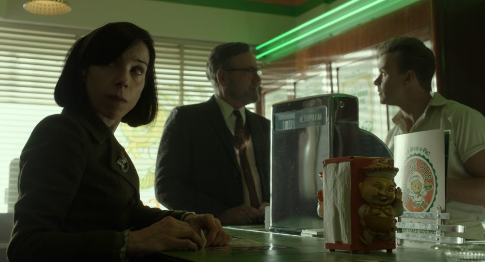
After watching The Shape of Water, one particular scene kept resonating. It was a minor scene, not even necessary for the plot, but a timely scene. The scene occurs in the Dixie Doug Pie shop (not the scene pictured above, but a later scene).
Giles played by Richard Jenkins sits next to the proprietor of the shop at the counter, enjoying a slice of pie when a black couple walk in seeking to be served. The store owner tells them – “take out only” and the couple protest that the pie shop is empty – why can’t they sit and the owner responds that they must leave. Just before the couple walks in, Giles reacts to the store owner telling him that he is good at his role of chatting with customers by holding the owners hands. The store owner jumps off his stool and basically refers to Giles as a dirty old man. After telling the black couple to leave, the store owner (originally from Ottawa, Canada with a fake southern accent) tells Giles that he should do the same and leave. Giles takes his napkin to his tongue, trying to clean the pie out of his mouth (has Eliza had done earlier with the green pie), tosses the napkin on his plate and exits the pie shop.
Part of the beauty of The Shape of Water is in the nuances; the attention to details that later resonate with the viewer. If one considers many of these details, the film is an anti-capitalist gesture. Early into the film the pie guy explains that his store is part of a franchise and that franchising is the future. Many other elements in the movie represent the future or a changing society in which there is no place for intimacy and oddity. Instead the future is mass produced, sleak, fake and hostile. And tied to the future is commodification and materialism.
We see this alienating future throughout the film. Giles an illustrator, hand paints magazine advertisements. Eventually he finds himself without a job due to the adoption of photography in advertisement. The hand-made has been replaced by the mechanized image that is fast and precise.
Regarding Giles’s Rockwell-like depiction of an ecstatic nuclear family enjoying jello – there is the detail of the color green. Giles originally paints the jello red, but he is told that it must be green. The color green becomes a reoccurring element in the film. The slice of pie that Eliza finds disgusting and must remove from her tongue using a napkin is bright green. To Strickland, the antagonist, the sleek new Cadillac is green. Whether it is the jello, the pie or the car, green is used as the color of artificial products – products that represent the future. Simple associations to the color green are of course envy, greed and money – all elements of capitalism in its purest form that is to generate capital for the sake of greater capital, regardless of any human toll.
As with the green pie which is disgusting to Eliza, the beautiful green Cadillac is scarred by the hand-painted van filled with misfits. In the end, Strickland, the man of the future is defeated and the promise of the future falls short to the monster, the mute and the homosexual.
Calder & Oiticica at Whitney Museum
If you enjoy work that breaks the norms of fine art; work that invites the viewer to participate, this is a great time to visit the Whitney Museum of American Art.
Through the remainder of the month, on the 8th floor, one may see Museum employees activate Alexander Calder sculptures. With slight touches and hand gestures, Calder’s work is set in motion as it was meant to be enjoyed. Several pieces on display are motorized, unfortunately they do not appear to be plugged in or at least when I was there I did not see them in motion. However, the ones that are activated by human touch are beautiful to see in motion. One may immediately capture the great care that Calder took in combining form and weight to create compositions that have expression through movement. The works are simple and delicate but when they are put in motion they appear to have their own life due to the joints and careful balancing of the pieces assembled to make the whole.
Work your way down the museum and I believe that it is on the sixth floor that one will encounter “An Incomplete History of Protest”. As problematic as the labels “Protest Art” or “Political Art” may be, many of the works in the exhibition were not made in the studio for the gallery, but were realized through collaboration and enjoyed public manifestation on the street in the midst of protest. I tend to consider such art as genuinely “political art” or “activist art”. The exhibition does a reasonable job of presenting an overview of such work over the last fifty years in the United States.
Further down the building, perhaps on the fifth floor is “Hélio Oiticica: To Organize Delirium” which to me is the most fun of all the exhibitions on view. It is unfortunate that the Brazilian artist Hélio Oiticica died at 42 as he was prolific and realized work that is at once provocative, social and contemplative. Several of the galleries, allow the viewer to walk through the work or even wear the pieces as Hélio Oiticica meant the work to be! This is great as it is not uncommon for work originally designed to be tactile has been removed from the visitor’s reach, not so with Oiticica’s exhibition. One gallery even features clothing designed by Oiticica hanging on a rack, for visitors to try on and model in front of a mirror. A walk through the installation “Tropicália, 1966–67” alone is worth the trip to the Whitney. As one winds through the installation, visit the two large parrots in a white cage and if you go around 3pm when they are fed by their handlers you will enjoy their sounds resonating throughout the exhibition.