Archive for the ‘data visualization’ Category
Chasing Bits a Web Platformer Game

“No Media” is an online exhibition featuring art work entirely made from code. This means no media files – no jpg or gif or png or mp3 or wav or mp4 or webm or any type of self-contained file type. When I was invited to participate in this exhibition, it was a tricky proposition for me as I’m primarily a visual artist who uses software and generally when I code it’s in an environment such as Visual Studio with Unity. My web projects tend to include SVGs created in Illustrator or video or audio files… But I greatly appreciated the invitation and the challenge to work differently. However, I’m not a good coder, generally, I hack things together or review endless tutorials. In grad school at Carnegie Mellon University, I was allowed to enroll in the Computer Science intro to programming undergraduate course. This is a course designed to weed out those who will not go on to become programmers; I lasted three weeks.
I regularly use javascript, the language of the web, I wanted to make something that would be fun for people to interact with and I had been researching digital currencies for the last couple of years for another project. Since I was 11 years old, I’ve loved platformers due to my initiation as Activision’s Pitfall Harry in 1982. So I decided to take Marijn Haverbeke‘s entirely code-based javascript platformer game covered in his book Eloquent Javascript and inject it with a bit of Bitcoin and alt coin content. I feel that the platformer presents the ideal game metaphor for the dreams and pitfalls of alt coins. The game titled Chasing Bits has audio, but it’s the browser’s speech synthesis that reads a hidden text (no media). And there are emojis that may appear to be image files, but are also bits of code. (It’s probably time to add the death emoji.). There is one live data feed – the current value of Bitcoin which you may update throughout the game.
Since web audio generally requires a user event, players must click a button to trigger the browsers reading of the following passage:
What happens when a utopian idea for a decentralized currency gains adoption in the midst of hypercapitalism? Speculative investors looking to get rich quick, loose. The early bird gets the worm, the rest just dig for fools gold. Or perhaps the current value of bitcoin will triple and you head straight to the Cayman Islands to sip on rum and coke as you lazily sway in a hammock between shade and sunlight.
Unfortunately it is 2022, the U.S. government slowed the printing of free money, inflation has risen, uncertainty has set in and the happy go lucky period of Bitcoin and alt coins has taken a pause. Sit tight, wait 10 years and just maybe those Ethereum coins will be worth eighty thousand each! Or perhaps, the Financial Action Task Force may just clamp down and regulate Bitcoin and digital currencies due to money laundering and other criminal use of digital currencies. No one knows what lays ahead. So meanwhile, why not chase those bits…
I can not afford real property, so I buy land in the metaverse. I like going there in the evenings when I sit alone and wonder when others will join. Perhaps I will rent out some space and make more bits. However, I don’t like it when the earth quakes.
As soon as Bitcoin peaks again, I will buy a pig to store clones of all my primary organs, this way I will double my life span and live to a 180 and by then I will own a country in the meta verse and deliver my own currency. My anti gravity suit will keep me looking young. Meanwhile I will continue chasing bits.
Try the Chasing Bits, listen to that audio, check the current value of Bitcoin, I hope you are mildly entertained!
“Hansel & Gretel” at Park Avenue Armory – Save Your Money
The “Hansel & Gretel” curatorial statement describes the installation as a space that brings together Jacques Herzog, Pierre de Meuron and Ai Weiwei combined interests in
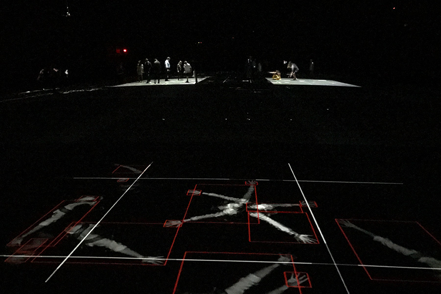
the psychological impact of architecture and the politics of public space; creating a playful, strange, and eventually eerie environment with different layers of reality revealed to the visitor… Hansel & Gretel is a dystopian forest of projected light where the floor rises up, as if lifted by an invisible force, and visitors are tracked by infrared cameras and surveyed by overhead drones as they systematically capture the parkgoers’ data and movements…
Unfortunately, the only portion of this description that resonates is the playfulness. Indeed Herzog, de Meuron and Weiwei have created a dark environment in which visitors may skip around and play with light traces of their image. However, the installation lacks strangeness, eeriness, politics or any psychological reverberation.
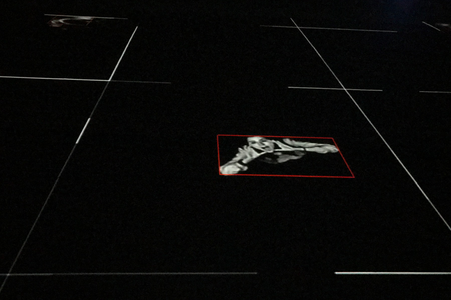
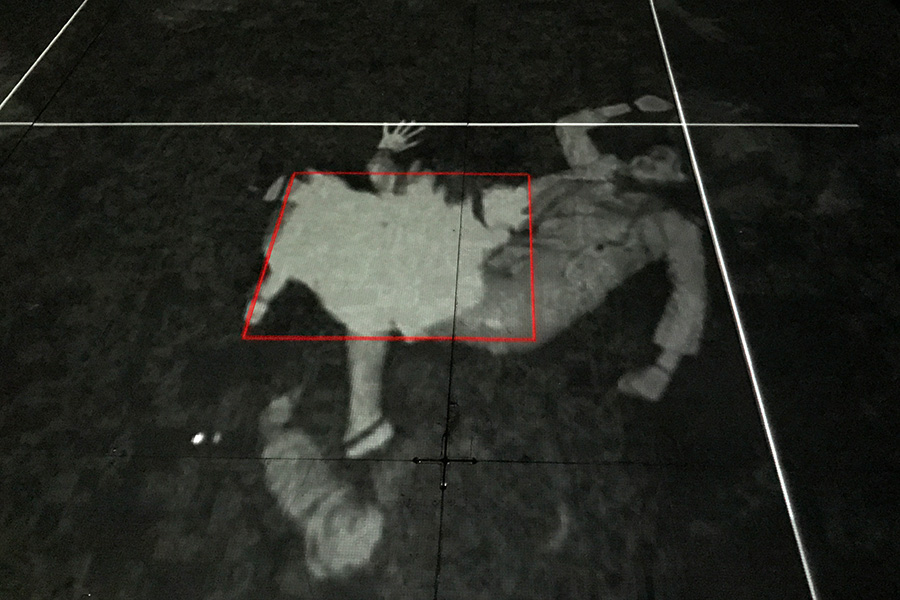
Other than the initial moment of discovery that one’s image is being projected on to the ground after it is periodically taken due to on one’s movement in the space, the installation presents very little that is interesting. The drones may have been a neat prop had they not been tethered.
The second part of the installation is a didactic revelation of what the installation is trying to allude to – that we are objects of surveillance. As far as a critical art installation regarding surveillance, there was much more interesting work done 15+ years ago. Perhaps the theme of surveillance has been so overly investigated and picked apart by art previously and by entertainment today (“Black Mirror” for example) that such an installation seems trite and naive. There is so much of our data being captured today, that building an installation that merely plays upon facial recognition and motion sensors is just kind of dumb, but it is playful. So if $16 is worth the cost of running around a huge dark open space and playing with light projection, check it out.
A second perspective: Playtime at the Armory
Once again discovering what this city has to offer, there I was with Ricardo walking into a venue called the Armory near Hunter College, a place I had never been before to see a new art installation called “Hansel & Gretel”. He had been keen to check this out for a few weeks, and like the curious creature I am, I followed along.
We received a quick intro and were instructed to read a phase on the wall before entering -which i forgot- and then allowed to enter. We walked into black nothingness. My immediate reaction was to scramble for Ricardo’s hand. I didn’t realize the massiveness of this place until my eyes adjusted from the summer sunlight to the darkness inside of the Armory. It was only eerie the first few minutes because I had no idea where the hell I was walking. There were a few cameras far above us hanging from the ceiling and lights that would follow us. As we continued to walk, our movement was detected, grid lines would appear and cameras would be activated to capture our moves. Suddenly, it was playtime! It was fun to pose in different positions to watch the resulting snap shot of yourself illuminated on the black floor. At one point my sweater and shoes came off and I really got into it.
Ricardo noticed two drones hovering on one side of the space living poor unfulfilled lives- tied onto leashes without free movement. It would have been more interesting if they were chasing people around. After exhausting our ideas for poses, the novelty wore off and we were ready to enter part deux of the installation. For that, we had to exit this part of the Armory and enter from another entrance on the other side of the street.
After pausing in front of a camera you were allowed inside. There were many ipads on long tables with apps. You could elect to have your face identified and then search the cameras for your photo which was taken in the first part of the installation. That was cool. You could read about the history of surveillance, or access cameras to spy on others walking into the exhibits. The Armory itself was impressive, the installation not as much. It was a new, interesting experience- a fun activity for kids, I would say. I didn’t leave with the feeling that I had witnessed an impressive statement against today’s constant scrutiny and monitoring that we are all under. I didn’t feel intruded upon. There wasn’t anything menacing or fantastical as is described in the program leaflet. It was just pretty cool and fun.
Perhaps the work behind the installation was complicated, but with my lack of technical know-how, I failed to appreciate the amount of effort involved. To have truly made an impact, more could have been done to confuse or play with the audience with the intention of throwing them off or perhaps even scaring them. Coupling that with the sound of Russian men having conversations in the background (that felt clandestine in nature), and I would have possibly left quite feeling differently.
ToxicSites.US Has Launched!
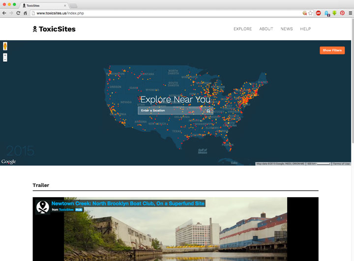
ToxicSites an interactive data visualization and sharing platform exposing the worst toxic contamination sites in the U.S. launched today at Photoville.
Toxic Sites pieces together complex data from the Environmental Protection Agency (EPA) to explore the over 1300 Superfund sites, or the worst toxic contamination sites, in the U.S. The project is by media artist Brooke Singer and funded by the Open Society Foundations’ Documentary Photography Project.
Programming at Toxic Sites during Photoville:
Dr. Sarah Durand, Biologist
Saturday, September 12 from 2-4pm in the Toxic Sites tent at Photoville
The Greenpoint Bioremediation Project (gBP)
Sunday, September 13 from 4-6pm in the Toxic Sites tent at Photoville
Gowanus Canal Walking Tour with The Gowanus Canal Conservancy
Friday, September 18 from 10:00–11:30am at Union Street Bridge (Union Street between Bond and Nevins Streets, Brooklyn 11215)
Gowanus Canal Clean & Green Paint Out
Saturday, September 19 from 10am-4pm at The Salt Lot (2 Second Avenue, Brooklyn 11215)
Public Lab Ghost Stream Mapping
Saturday, September 19 from 12–4pm in the Toxic Sites tent at Photoville
Amanda Cox at Columbia University
Yesterday (2/23/2015) morning I attended a data visualization presentation by New York Times graphics editor Amanda Cox at Columbia University’s Mailman School of Public Health. Amanda presented some great examples from the Times as well as other sources while breaking down her presentation to the topics Scale, Context, Pattern and Annotation Layer. I arrived late and missed the majority of the Scale portion. The following are notes from the presentation…
Make the data open, make it flexible, present a user with an interface to manipulate the presentation of the data, to see the data in various groupings.
The power of text: the most common thing that people do on a page is read and by far it is only the top of the page that people read. Most people do not click on buttons.
The example that Amanda presented regarding pattern is “Mapping America: Every City, Every Block”
Form is key to revealing patterns – use of familiar geography to superimpose information employing color, shading, shape and size. In geographic placement of data regarding the House District results one may quickly grasp that urban versus rural areas is decisive.
Annotation Layer
Annotation should be minimal, no more than a layer of pointers or outlines or brief notes superimposed onto graphics be it image or video. Amanda momentarily turned it over to a video interview with NY Times Science Graphics Editor Jonathan Corum:
She then presented a brief video documentation explaining aerial skiing by United States Olympic aerialist Ryan St. Onge and science reporter Henry Fountain in which extremely simple annotation is superimposed on to the video to make important points. She also compared this very simple graphic with and without annotation – “graphs are stronger when they say something” – Amanda Cox.

Peak Break-Up Times without Annotation
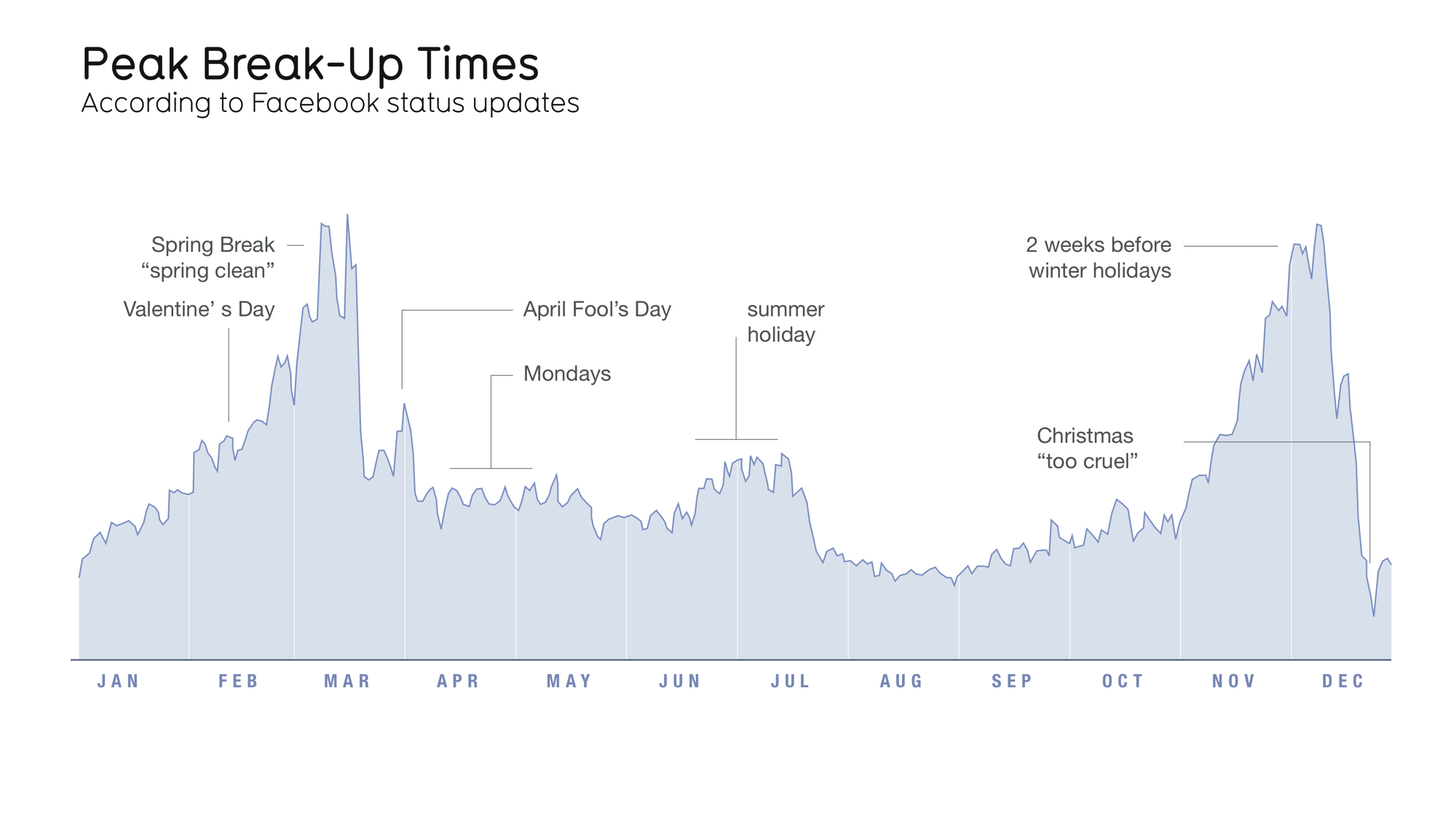
Peak Break-Up Times with Annotation
An example of the using annotation to illustrate different ways of looking at data is the NY Times “One Report, Diverging Perspectives” – a visualization of the last jobs report before the 2012 elections. The visualization allows one to view the report with “Democratic Goggles” and “Republican Goggles.” The data is the same and both interpretations are true, however the manner in which the data is interpreted depends one’s perspective.
Amanda Cox showed varying forms of engagement through the representation of data. In “All the Medalists: Men’s 100-Meter Sprint,” the reports begins the page with a 3D video animation that depicts the change of speed of gold medalists in the 100 meter run from 1896 to 2012. Following the video the page scrolls down to scatterplot displaying the same information. Of course, the time based animation will engage the viewer very differently than the static scatter chart.
The final example that Amanda Cox presented was a the superimposition of two separate data visualizations to present a cultural and historical reality of the United States. One was a visualization of the Republican versus Democratic votes in the 2012 Presidential Elections from southern states. The pro-Obama areas presented an arch of concentration that presented strong similarities to a very old visualization of cotton farms across the same states. When these two visualizations are collapsed one over the others, a strong sense of history regarding the present is established as the areas that were once cotton farm areas voted strongly for Obama.
Amanda made a point that beyond interactivity and cool graphics is the strength of the content. If one has minimal resources, focus on the content and in depth research. Practically, with so many people looking at the web on their phones, a simple text and image may be much more effective than an immersive experience.
Visualization of #ICantBreathe, #BlackLivesMatter, #HandsUpDontShoot
Using CartoDB user SRoghers has created a visualization of the hashtags #ICantBreathe, #BlackLivesMatter and #HandsUpDontShoot on Twitter