Archive for April, 2018
Zach Blas Contra-Internet at Art in General
Contra-Internet: Jubilee 2033 trailer from Zach Blas on Vimeo.
I had been looking forward to seeing Zach Blas’s Contra-Internet exhibition at Art in General, unfortunately it was not as engaging as I had hoped. The exhibition presents one single channel video installation that features the nearly 30 minute film “Jubilee 2033” and three other single-channel video works on monitors. The three video works on monitors present ideas and research regarding the internet – the hegemonic network of today and for the foreseeable future – through computer screen recordings by Blas. (I really hope that artists stop using screen-recordings of themselves clicking through files as a medium; it’s seldom interesting.)
Although I was disappointed by the exhibition, the gravity dance performance by Cassils as Nootropix, “a contra-sexual, contra internet prophet” is captivating an entirely worth the trip. The premise of the film is funny as it opens with Ayn Rand discussing the future of her ideas with two of her followers – Alan Greenspan and a fictional character Joan Mitchell. A young Greenspan proposes that the group take an acid trip. I was turned off by the highly accented performance of Rand and her cult, so I was glad to see them drop liquid acid.
As the trip begins, an internet connected artificial intelligence in the form of a manga character appears and takes them in to the future. The future is of course dystopian as the present reality burns and it’s certainly fun seeing the Google headquarters burning along with other tech companies in the not so distant future of 2033.
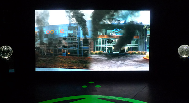
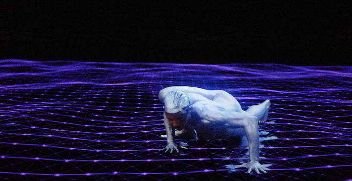
Along their travels, we encounter tech workers being taken hostage by “The Art Professor” wearing gray, paint-splattered coveralls and wielding a machine gun. Later in a classroom, the Art Professor introduces Nootropix (Cassils) who in their monologue states that they will perform the creation of gravity. The performance artist is powerful and their dance upon a purple matrix while dawning a large, erect, glowing CGI penis that is constantly spewing black liquid is awesome. The dance is mesmerizing and triumphant.
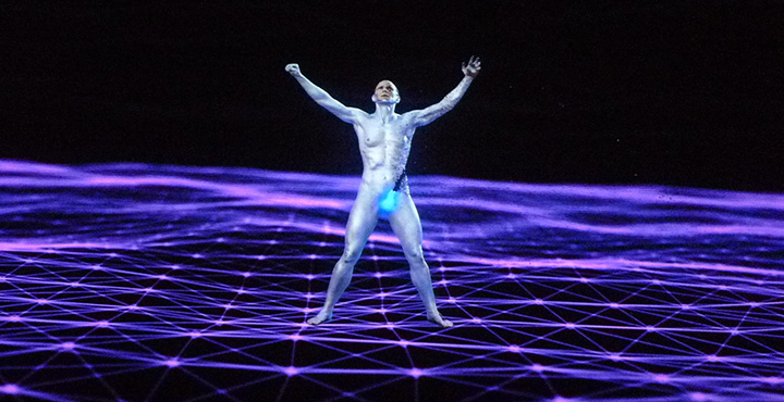
In Nootropix, Blas presents one of his contra-internet exotic creatures “to discover or create a world of network difference.” I could have entirely skipped the storyline, and merely be fantastically transported by Cassils’s character and performance as I think that it would have left me asking more questions and appreciating the mystery. We know that a network of difference is not plausible, so why not create the fantastic and shed the tedious philosophizing.
How To Get The Best Screen Printing Results From Your Art Submissions
Custom t-shirts are more than just an excellent way to express yourself, they’re also incredible ways to get your artwork in the public space. Whichever you’re placing a custom order for, it’s important that your art or design comes out the way you want it to.
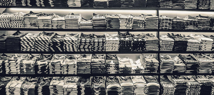
There’s nothing worse than seeing your work of art fail to translate to what you had in mind, which is where following this guide can help. Here’s how to get the best screen printing results from your art submission on sites like The TeeHive or Threadbird.
Using Vector
Vector based images and screen printing are a match made in t-shirt heaven. These files can be resized at any scale without losing an ounce of detail thanks to the mathematical equations surrounding their magnitude and direction. Even better, these images use both lines and curves.
When it comes to color assignment, vector is superbly clean. All you’ll need to create a vector image is a program like Corel Draw, Adobe Illustrator, or Inkscape.
Using Raster
Unlike vector images, raster uses pixels instead of lines. This makes using the correct DPI crucial from the get go, but it translates wonderfully to screen printing when done correctly. For reference, a web image looks stellar at 72 DPI while screen printing requires at least 300 to look decent.
While you might not be able to scale up with a raster image, you can create images at the same size they would be on the t-shirt. This gives you the ability to pay close attention to small details, which also helps in translation. Programs like Photoshop and Gimp utilize these types of images.
Screen Printing 101
The true secret to achieving a fine quality print is using highly defined artwork. That can be easier said than done, as many people find themselves with excellent art that simply isn’t ideal for screen printing.
Often times, individuals opt to do a test print first to make sure their design will translate like they want it to. While it’s always a good idea to test out a company’s quality first, test prints are often made using a different technique. Most of the time, companies will use a digital print or direct to garment printing.
The best way to make sure your art will look fantastic after the printing process is done is to contact the company you plan to work with. It isn’t uncommon for their artists to be able to recreate your image in a more screen print-friendly version. Always double-check to see if that comes with an extra cost, though.
Tips and Tricks
When uploading files to print, make sure they were created in the proper format beforehand. Simple saving something as a .pdf or .eps isn’t going to cut it when it comes to the quality you’re looking for.
Avoid using:
- .jpg
- .png
- Photographs
- Sketches
- Or anything with a low resolution
If you are dealing with hard copies of your artwork, it’s best to email the company you’re considering working with. Most have designers on hand that can work with you to ensure your work of art translates properly to the screen printing process. If you happen to live close by, it never hurts to drop in for an in-person chat.
Getting the Color Right
If your design is pre-made and ready to go, then all you’ll need to do is pick the color garment you think it would look best on. Try out different option to see what you like the most, and don’t be afraid to use multiple colored clothing items.
When designing from scratch, you have more ground work to do but a lot more room to play with. Simulate both ink and garment color combination by creating mock-ups first so your can proof the results before placing an order.

Most printing services use Pantone colors, but it’s important to keep in mind that the colors you’ve used in your vector or raster piece might become slightly off during the printing process. This happens because computer monitors vary widely in color, brightness and contrast.
What you see on your monitor might not be the same the printer sees on their screen. If you own a Pantone Solid Coated Formula Guide, then making a note of which shade you intended to use will solve this problem. If not, the printer will choose the closest available Pantone based on what they see.
Nailing the Best Prints
Getting the best screen print results for your artwork takes some time and dedication, but the above advice will help your work translate the best it possibly can. You’ll have a slew of awesome t-shirts ready to go before you know it!
This articles has been written by Ashley Lipman