Archive for the ‘New York Times Graphics Editor’ tag
Amanda Cox at Columbia University
Yesterday (2/23/2015) morning I attended a data visualization presentation by New York Times graphics editor Amanda Cox at Columbia University’s Mailman School of Public Health. Amanda presented some great examples from the Times as well as other sources while breaking down her presentation to the topics Scale, Context, Pattern and Annotation Layer. I arrived late and missed the majority of the Scale portion. The following are notes from the presentation…
Make the data open, make it flexible, present a user with an interface to manipulate the presentation of the data, to see the data in various groupings.
The power of text: the most common thing that people do on a page is read and by far it is only the top of the page that people read. Most people do not click on buttons.
The example that Amanda presented regarding pattern is “Mapping America: Every City, Every Block”
Form is key to revealing patterns – use of familiar geography to superimpose information employing color, shading, shape and size. In geographic placement of data regarding the House District results one may quickly grasp that urban versus rural areas is decisive.
Annotation Layer
Annotation should be minimal, no more than a layer of pointers or outlines or brief notes superimposed onto graphics be it image or video. Amanda momentarily turned it over to a video interview with NY Times Science Graphics Editor Jonathan Corum:
She then presented a brief video documentation explaining aerial skiing by United States Olympic aerialist Ryan St. Onge and science reporter Henry Fountain in which extremely simple annotation is superimposed on to the video to make important points. She also compared this very simple graphic with and without annotation – “graphs are stronger when they say something” – Amanda Cox.

Peak Break-Up Times without Annotation
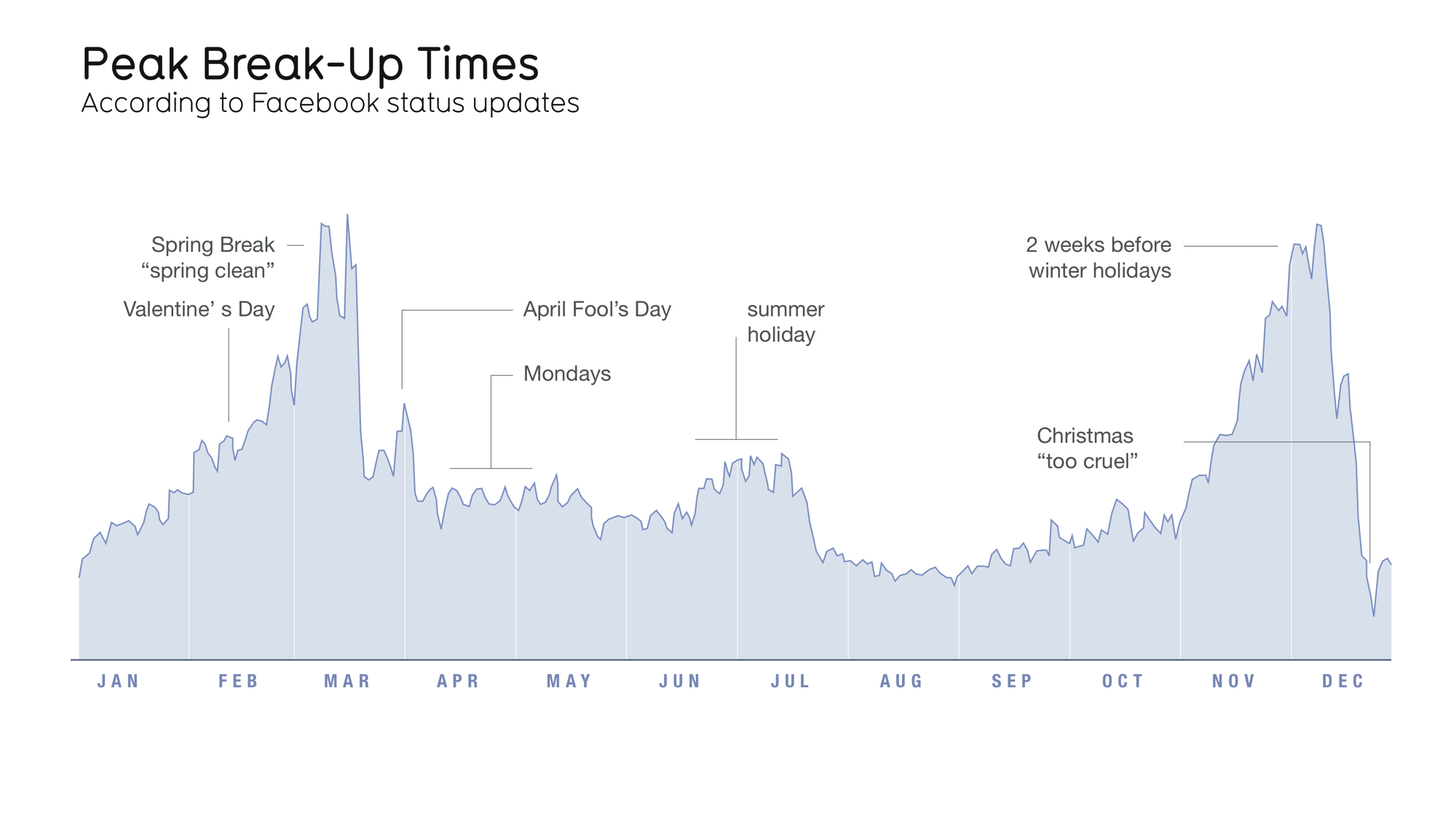
Peak Break-Up Times with Annotation
An example of the using annotation to illustrate different ways of looking at data is the NY Times “One Report, Diverging Perspectives” – a visualization of the last jobs report before the 2012 elections. The visualization allows one to view the report with “Democratic Goggles” and “Republican Goggles.” The data is the same and both interpretations are true, however the manner in which the data is interpreted depends one’s perspective.
Amanda Cox showed varying forms of engagement through the representation of data. In “All the Medalists: Men’s 100-Meter Sprint,” the reports begins the page with a 3D video animation that depicts the change of speed of gold medalists in the 100 meter run from 1896 to 2012. Following the video the page scrolls down to scatterplot displaying the same information. Of course, the time based animation will engage the viewer very differently than the static scatter chart.
The final example that Amanda Cox presented was a the superimposition of two separate data visualizations to present a cultural and historical reality of the United States. One was a visualization of the Republican versus Democratic votes in the 2012 Presidential Elections from southern states. The pro-Obama areas presented an arch of concentration that presented strong similarities to a very old visualization of cotton farms across the same states. When these two visualizations are collapsed one over the others, a strong sense of history regarding the present is established as the areas that were once cotton farm areas voted strongly for Obama.
Amanda made a point that beyond interactivity and cool graphics is the strength of the content. If one has minimal resources, focus on the content and in depth research. Practically, with so many people looking at the web on their phones, a simple text and image may be much more effective than an immersive experience.