Philosophy Works 2023-24 Ad Campaign

“The School of Practical Philosophy & Meditation offers a journey of self-discovery that guides students toward understanding their innate wisdom and appreciation of the underlying unity connecting us all. Philosophy Works, the introductory ten-week course, prepares students for mantra-based meditation, an offering upon completion.”
THE CHALLENGE
In-person enrollment has been dropping for the last two years. The brand identity has gone through many iterations. We need a campaign that will once again establish the School as the NY community hub for Practical Philosophy.
THE GOAL
To reach our audience more efficiently, speak to their pain point and engage them with the benefits of PHILOSOPHY WORKS. We expect to increase our in-person Philosophy Works classes on the Upper East Side and Tribeca.
MY DESIGN APPROACH
When on the subway, I seek out the illustrations commissioned by the MTA and I tend to lose myself in the stories that the illustrators create. I do not seek out advertisements. (Of course, I don’t need to as they can’t be missed.) Generally, the advertisements are not engaging. My approach to this project is to be a visual artist and storyteller, not an advertiser. My goal is to create an in-car advertisement that people may lose themselves in through illustrated New Yorkers and the possible interactions and activities of these characters. The School’s Creative Director, Jaime Sears felt that the advertisement needed to speak to the difficulties and uncertainties (“pain point”) commonly experienced by New Yorkers at this time. Ideally, the scenarios in the illustration will be familiar to most New Yorkers.
With these concepts in mind, I rode the subway and traversed the city. I photographed fellow commuters and eavesdropped on their conversations, observed their interactions. Specific individuals and life moments are represented in the final illustration. The majority of the characters in the final composition are real New Yorkers – commuters, pedestrians, recyclers, and even our infamous subway rats…
THE CAMPAIGN
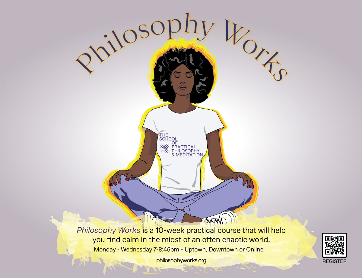
As meditation is a key element of the School and a practice known to calm people, I elected to have meditation be the central element to the design. Without the funds for a photo shoot, I searched online for people meditating. I found an attractive young woman sitting on the floor with her hands’ index finger and thumb touching. At the School, people generally meditate in a chair, however, design-wise, I felt that the chair would take up too much horizontal space, so I purchased the rights to the photo of the woman on the floor in a criss-cross applesauce pose and changed the hand pose. I based the central illustration on this photograph. I also wanted to make the name of the School central, so I placed the School’s name on her t-shirt at the very center of the design.
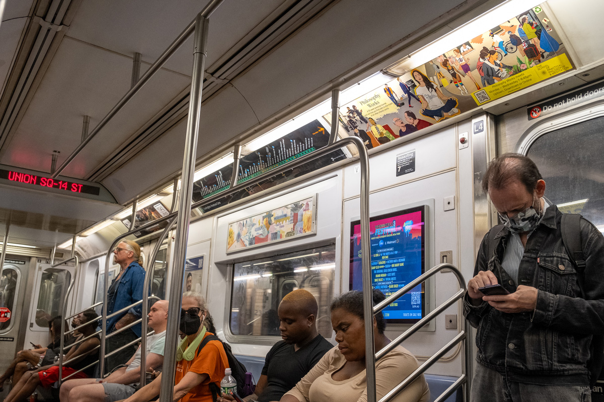
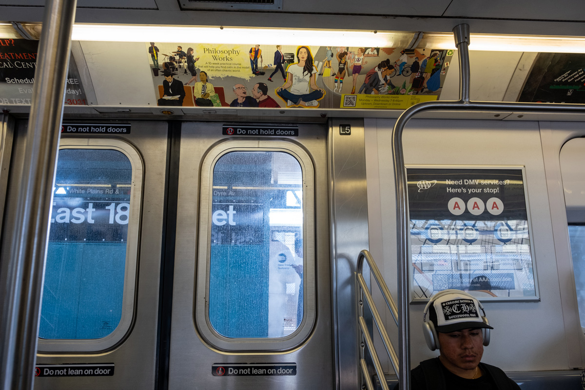
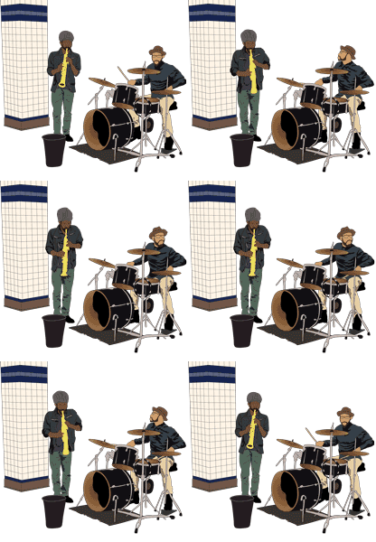
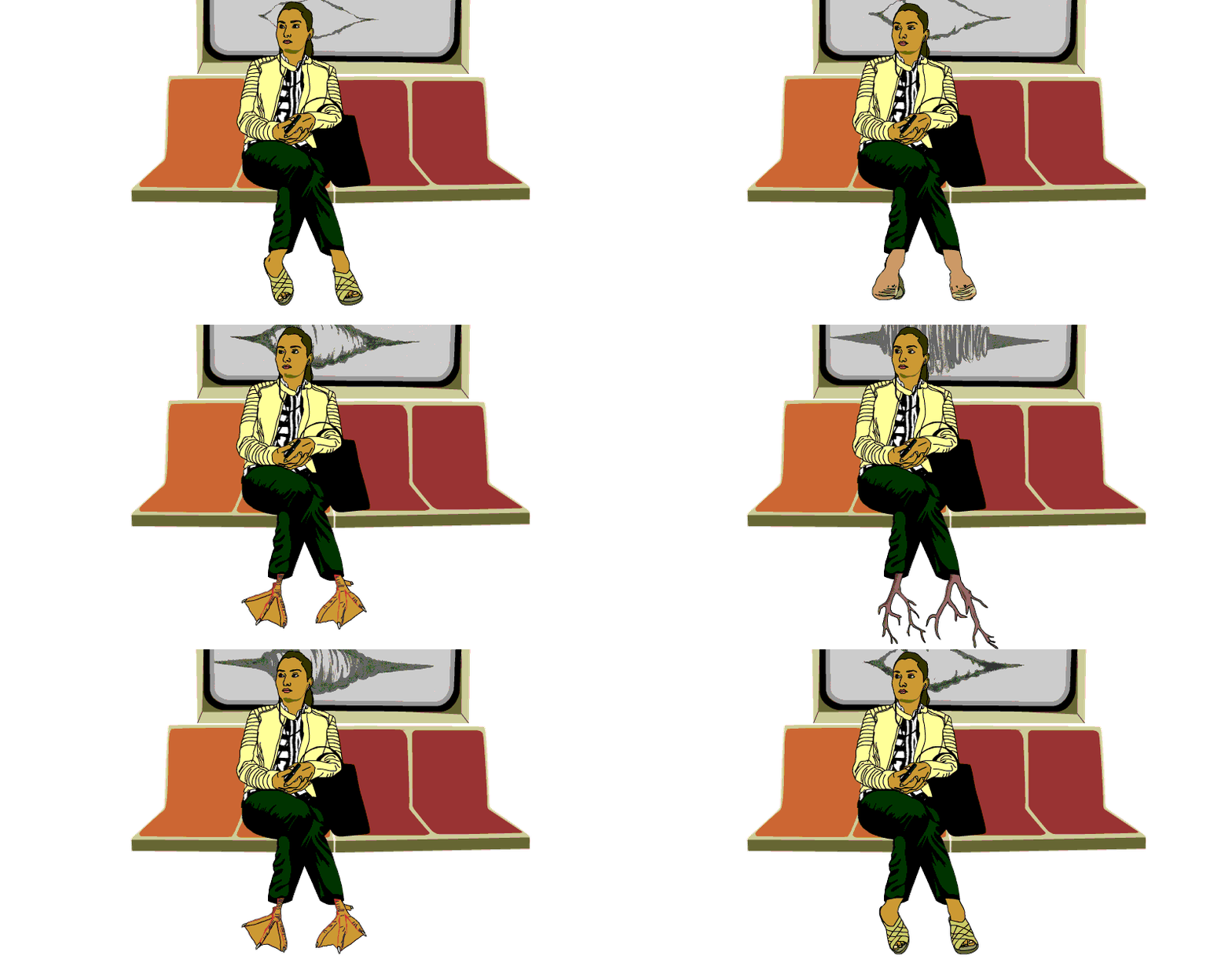
I surrounded the meditating woman with vignettes of everyday life from subway to street. Moving from left to right: subway musicians, a Hasidic commuter studying, a young woman with her earbuds in place, a businesswoman busily texting, two men in conflict, an MTA maintenance worker sweeping as he watches a business dandy toss his coffee cup on the platform floor with a trash can nearby… At the center, a woman meditating with a fiery aura outlining her figure. Then to the street (right side of the design) – a young female pedestrain wearing a surgical mask, PRIDE revelers enjoying life, an older man observing the street scene from his window, a mother and daughter gardening, a food delivery guy on his bike, and people recycling. A few of these illustrations, I had already created for past projects. The subway musicians and female subway rider I rotoscoped long ago for a series of animations reflecting New York City life. The rat and delivery guy are from a 2D video game and installation, una geografia de ser. Recycling past illustrations was necessary as the turn around on this project was very tight. However, the rest of the work is new.
I created a version of the graphic illustration with thought bubbles or spoken text for the various characters, but the School preferred that viewers interpret the illustration for themselves. Throughout the illustrations, I attempted to represent points of conflict that are common to the density of New York City.

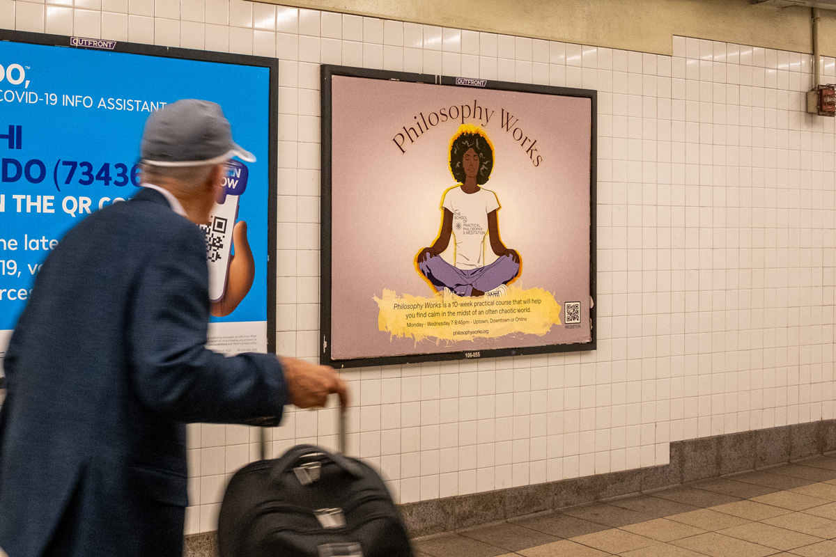
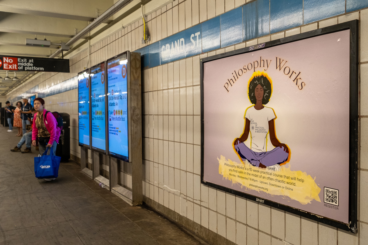
The platform poster is much simpler and hopefully striking. It merely presents a woman meditating. Since people are on the platform for a shorter span of time, waiting to get on a train or exiting the station, I wanted to create a graphic that would immediately speak to the commuter.
Here are images posted in the subway cars and in the platforms:
