Archive for the ‘New York’ Category
Art Downtown NYC January 2026
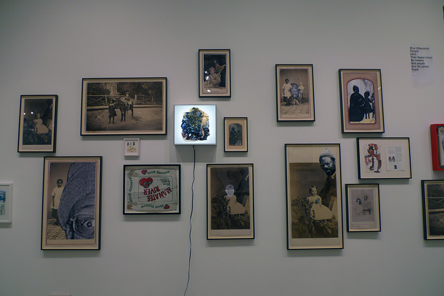
Yesterday, Saturday, November 24th, 2026, a day before a massive snowstorm, I headed into lower Manhattan to visit my exhibition and consider what to do with my many panels, but also to view art with the hope of gaining some inspiration. (Lately, I have many ideas popping into my mind, but I feel scattered-brained and have trouble focusing in order to execute or at least get started with some of these ideas.) The Storefront for Ideas was closed, so I didn’t have a chance to spend time with my work, so I continued from 172 Walker Street toward Broadway. I was searching for Jack Shainman Gallery by memory and mistakenly thought it was on Broadway (it’s at 46 Lafayette Street). Fortunately, my error led me past Stephen Friedman Gallery, I paused, looked in, and entered to discover the beautiful and powerful work of Santiago Yahuarcani.
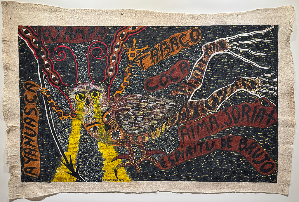
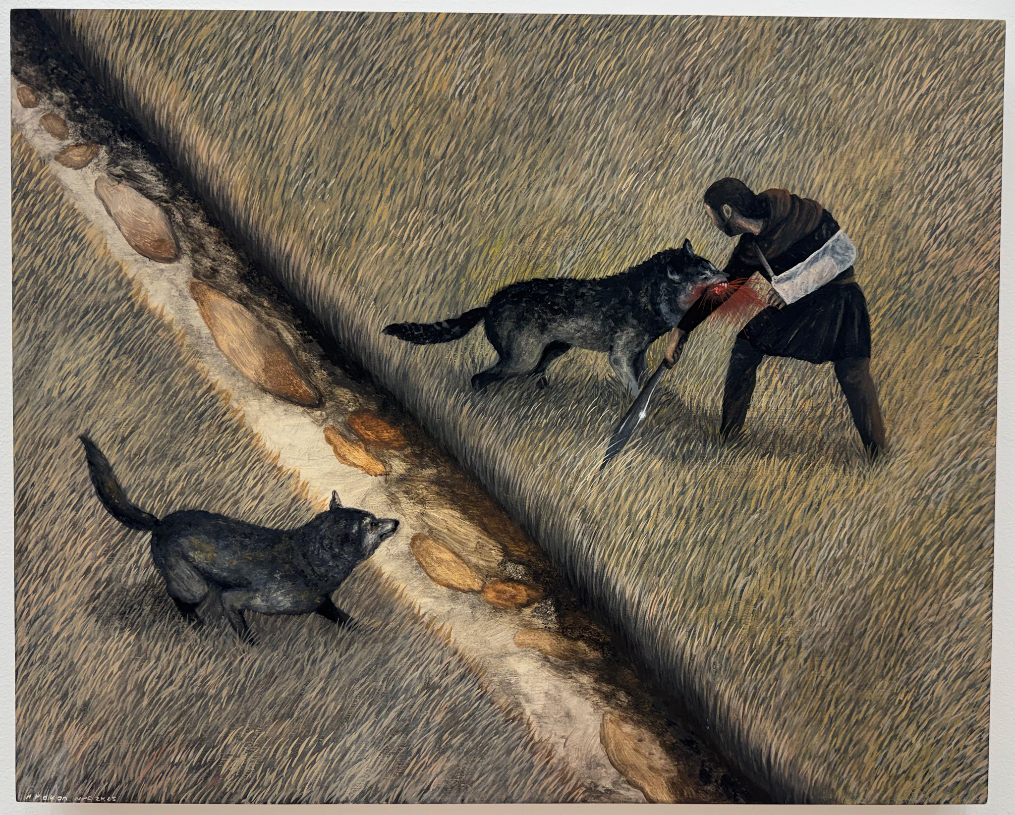
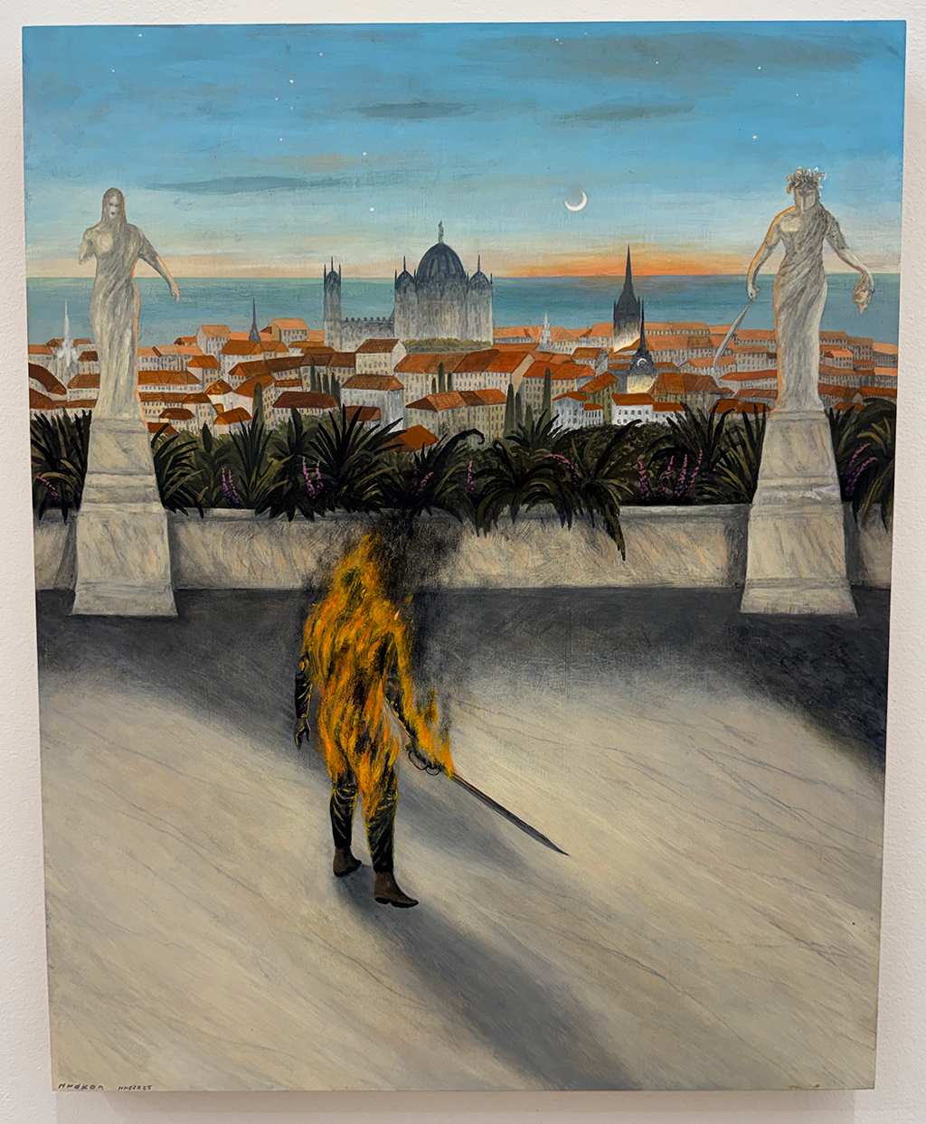
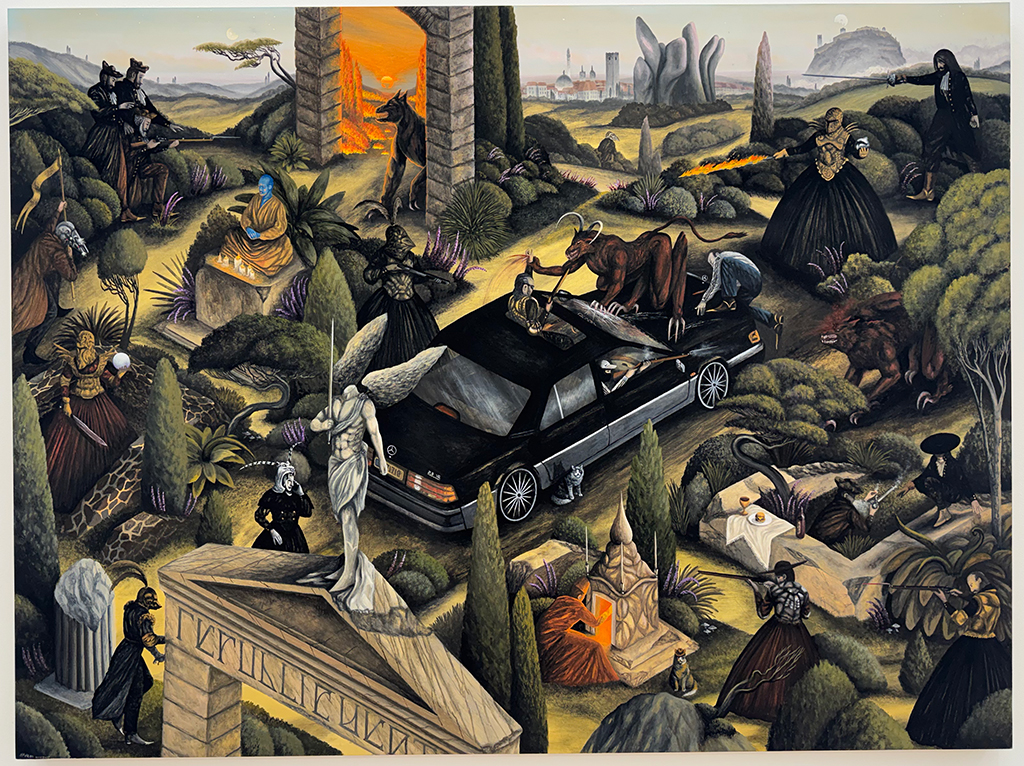
Yahuarcani creates magical paintings on handmade paper. They are incredibly detailed, filled with pattern, and color. For example, against a black backgournd with small yellow brushstrokes is ESPIRITU DE BRUJO, a flying creature that begins with long flowing toenails that evoke roots attached to human feet and legs patterned with a mix of tiger and leopard markings. Where the legs meet, begins a wing and body of an owl. The owl stands with its own set of legs and has two faces, one on its chest and the other at the head. From the top of the body two arms are raised out, one holding a spear. From the large, round yellow eyes of the top face emit yellow rays downward and widening to the bottom of the painting. At the base of each side of the owl’s head begins a red outline that open up near the top of the head at each side to extend to the top of the painting. Within these red lines are a chain of eyes. The words “AYANUASCA”, “OJAMPA”, “TABACO”, “COCA”, “AiMA.JORiAt”, “ESPiRiTU DE BRUJO” surround the magical creature. Each word is in black against a deep red or orange background. I’m only describing one of many paintings. Some of the paintings have richer environments with a visual narrative, portraying the destruction of the natural world due to human greed.
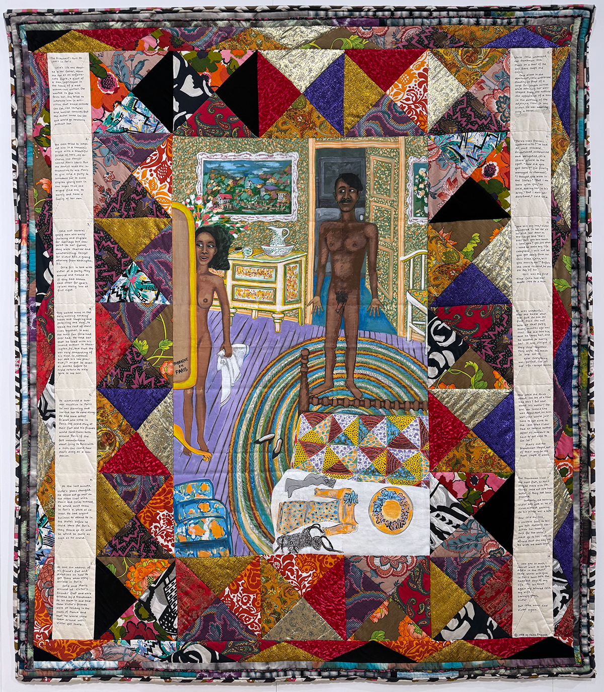
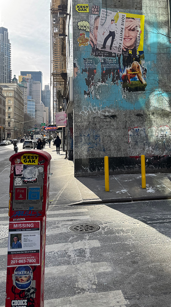 Along Broadway, I encountered an empty building with a rich facade of old, layered posters. Once I realized that Jack Shaiman was not on Broadway, I took out my phone and searched nearby galleries. I then proceeded to Jack Shaiman Gallery to view a beautiful collection of Faith Ringgold works. I’ve never been a fan of Ringgold’s work, mostly because I don’t get excited about quilts or works on quilts, but these show had me look more carefully and encounter the humor and narratives in her work. And due to the length of her life, the work is much more diverese than the popular quilt paintings. I particularly enjoyed the giant quilt painting with a naked woman – Celia standing at a mirror with a man Victor wearing nothing but a black beret stepping from the bathroom. The painting is lined on the left and right by the love story of Celia and Victor.
Moving along, I encountered three more excellent exhibitions Hydeon’s Eagertalis at Nicelle Beauchene Gallery, Regina Silviera’s Latin American Puzzle at Alexander Gray Associates and John Kelly’s A Friend Game Me a Book at PPOW.
Philosophy Works Winter 2025 Advertisements

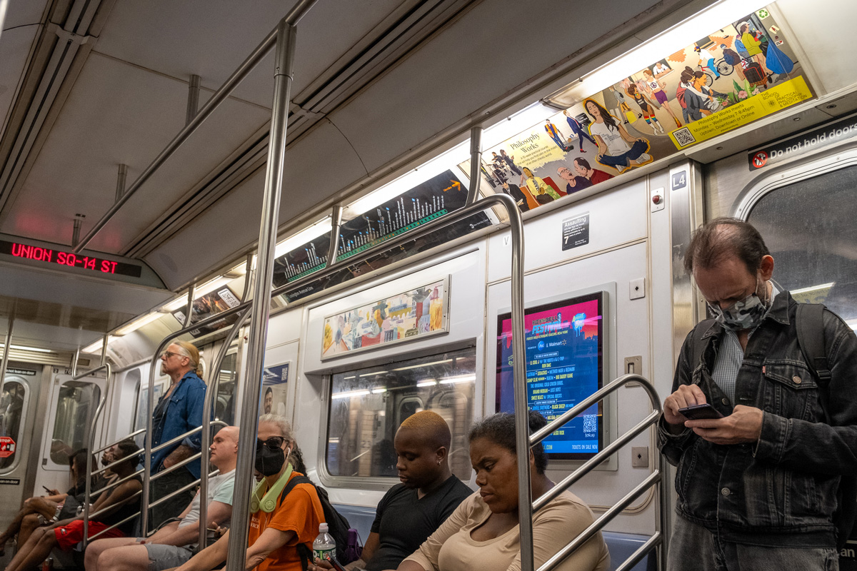
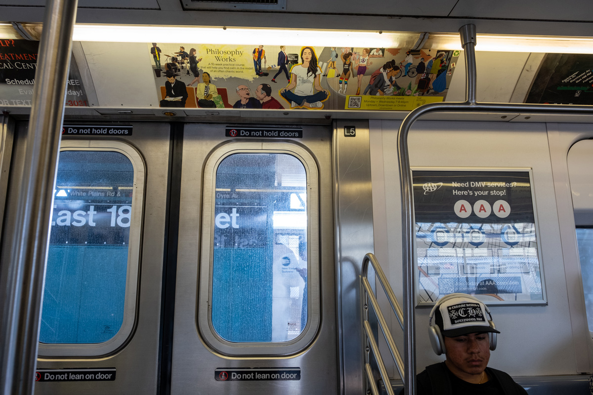
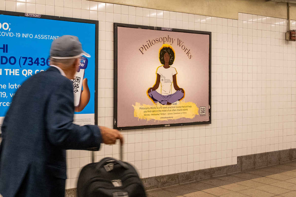
Once again working with The School for Practical Philosophy & Meditation’s Director of Marketing Jaime Sears and Marketing Consultant Adam Wasserman, I launched our initial meeting by sharing two of my favorite MTA commissioned illustrators – Jillian Tamaki and Sophie Blackall. I recounted how upon seeing these illustrations in the subway cars, I would get lost considering all the characters these artists created and the New York archetypes represented. Both Adam and Jaime were taken by Sophie Blackall’s illustrations in particular – one of a crowded scene within a subway car. Adam thought it would be fun to have our own past campaigns mounted as the advertisements within the car. Either at this initial meeting or the following meeting, Adam shared an image of a person in a meditation pose that appeared to be created from layered construction paper. In doing so, he proposed a shift in aesthetic to try something new. Adam used Adobe’s generative AI tool, Firefly to create the image. It was an exciting departure from the vector-based illustrations that I had been creating for The School and Jaime liked the aesthetic, so I agreed to give it a try.
After spending a bit of time with Adobe Firefly, I realized that getting a successful image would be a great deal of work. The tool generates a lot of odd glitches when it comes to details and of course even with highly detailed text descriptions, it cannot generate what one has in mind. Fortunately, my years of painting as well as digital composting, helped me formulate a plan – I would breakdown the image from background to foreground, treating each element individually and I would need to provide precise reference images. I would also need to correct obvious glitches.
One morning, I got up early to photograph an empty subway train as well as individual passengers to use as reference images. I composited multiple images of one side of a subway interior, to delete the center pole and expand the width of a single bench. The empty car composite as a reference successfully generated the setting for the poster. The image below was the team’s favorite.

I removed the backgrounds of individual riders to simplify the reference images. However, even with this step, I needed to carefully mask the Firefly characters from their backgrounds to set them on the subway car bench and of course digitally corrected many oddities.

I considered the elements that make riding the New York City subway unique in comparison to other cities such as musicians and dancers. Online I found a mariachi bassist, as well as a pole dancer to use as reference images. All three of us, Jaime, Adam and myself, felt that these two characters were what made the image engaging. Unfortunately, upon review, the MTA flagged the two characters and they had to be deleted.

I recycled past illustrations to generate a few of the characters such as the two women toward the left of the poster, the central meditator and the man reading a book at the far right. The dog in a hand bag was the result of searching for countless reference images and coming across an article about the COVID uptick of dogs on the subway. The aura behind the meditator required masking, gradients and fiddling with opacity to get it right.

Lastly, I worked on the subway car windows and the elements outside the car. Between Illustrator and Photoshop, I created a gleam as a window effect. I found a photograph of a flying pigeon as a reference and used NYC skyline images to help generate the buildings in the distance. To the right, I added a blue gradient for the copy and fussed with text to have it fit nicely.
The Marketing Team came up with the catch phrase “ELEVATE YOUR EVERYDAY.” We tried a few fonts before landing on the sharp and clean Futura bold with a drop shadow to finalize the poster.

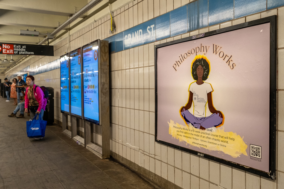
The platform poster was a good deal quicker as it consisted of one character, reuse of the aura and relatively minor digital editing of the background. However, I consider it a boring poster that does not reflect the nuances of New York City.

As much as I enjoy the final in-car image, my takeaway regarding Adobe Firefly is that it’s useful for quick brainstorming and quick graphics for social media and email announcements. However, for a high-quality print image, Firefly generated images require a great deal of planning and painstaking digital retouching. Also, I did not mention the many many images generated before getting the ones that I could work with.
Spring 2024 School of Practical Philosophy & Meditation Advertisement Campaign
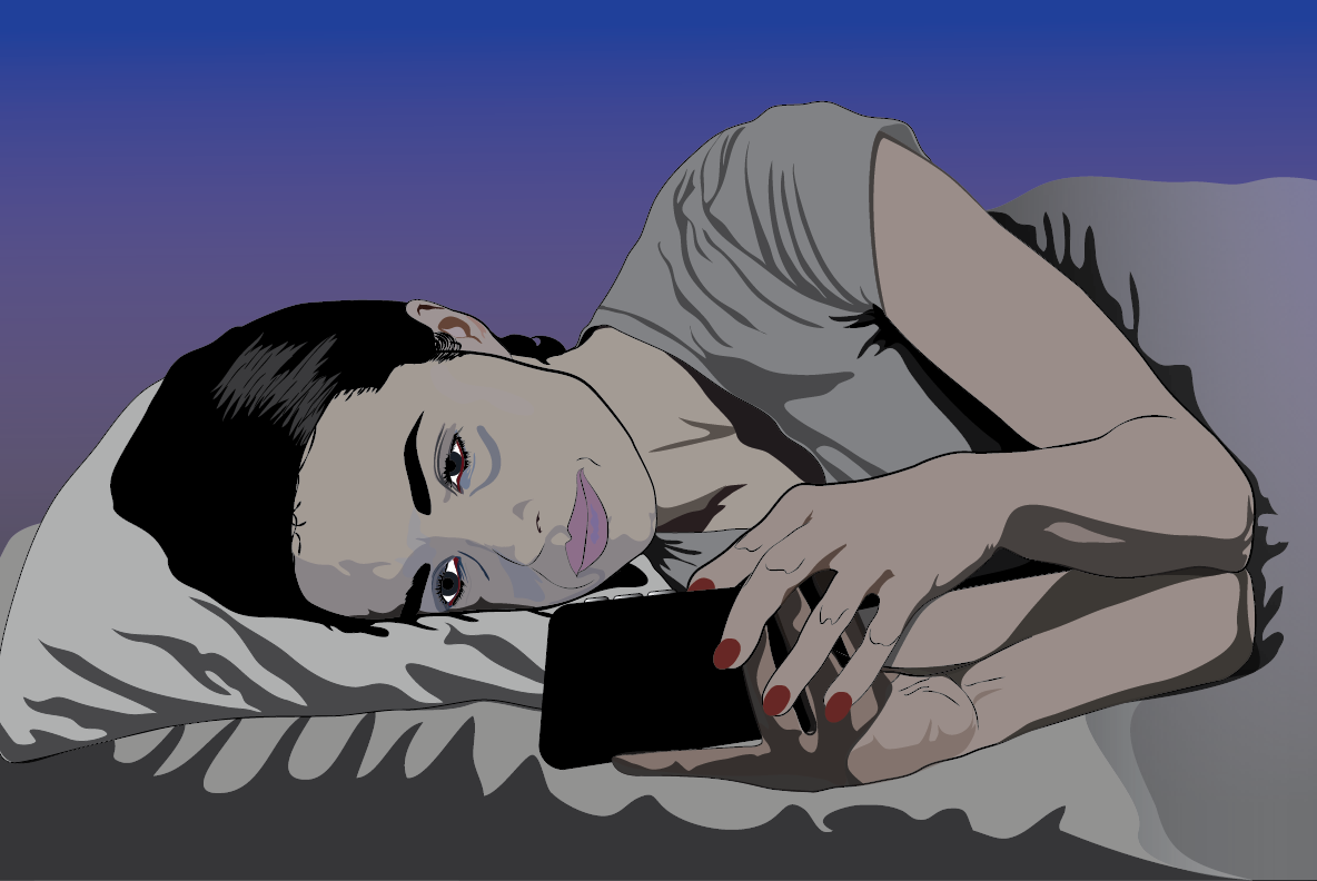
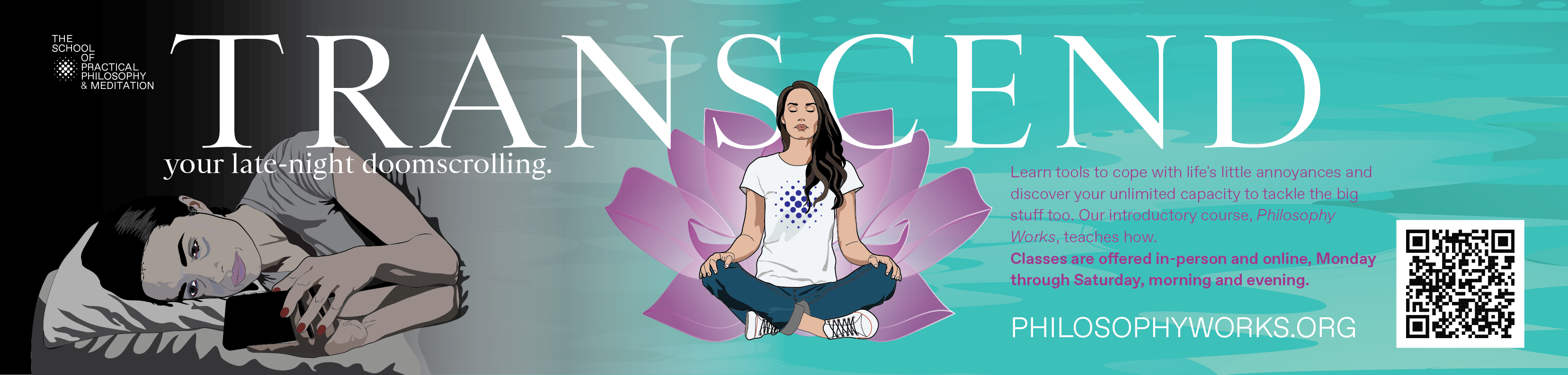
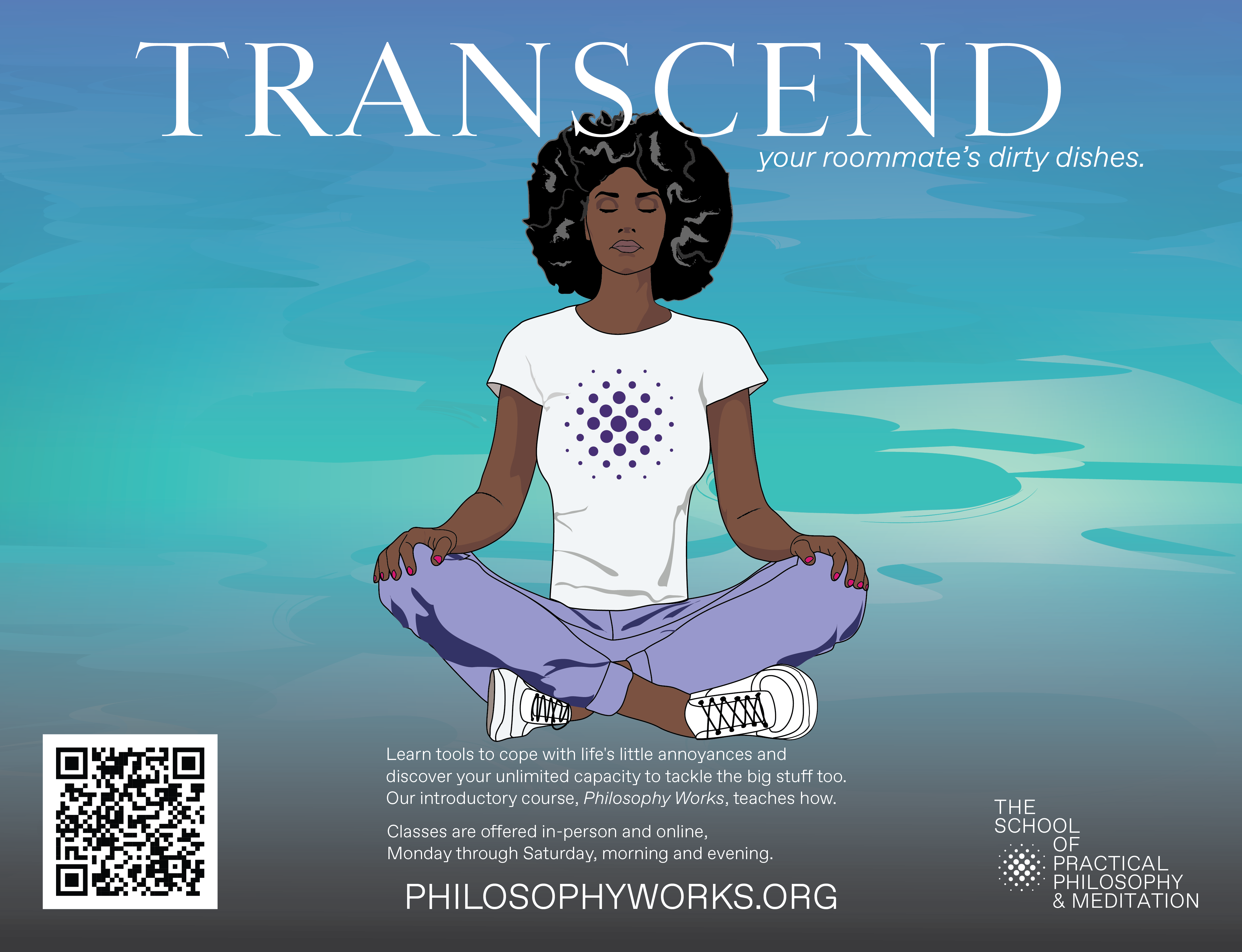
Jaime Rathore, the creative director for the advertising campaigns for The School for Practical Philosophy & Meditation once again hired me to create the MTA subway posters for the School. This time we worked with fellow School member and digital consultant Adam Wasserman to help generate ideas for the posters. Adam presented several ideas, the one that was selected features the word “TRANSCEND” trailed by a phrase that reflects common nagging realities (at least common to New Yorkers). A few of these phrases were:
- your late-night doomscrolling
- your roommate’s dirty dishes
- slow walkers
- your eight side hustles
The three that resounded best were: “TRANSCEND your late night doomscrolling,” “TRANSCEND your side hustles” and “TRANSCEND your roommate’s dirty dishes.” As both the budget and time were tight, I was asked to reuse some of the recent artwork. I did, however, create a new illustration for the doomscrolling concept (pictured above) as I didn’t have an appropriate asset. Below are the two in-car subway posters that will be presented above riders’ heads and one platform poster. Adam suggested editing the illustrated characters’ t-shirts from showing the entire School logo and name to only showing the logo (which I think works nicely).

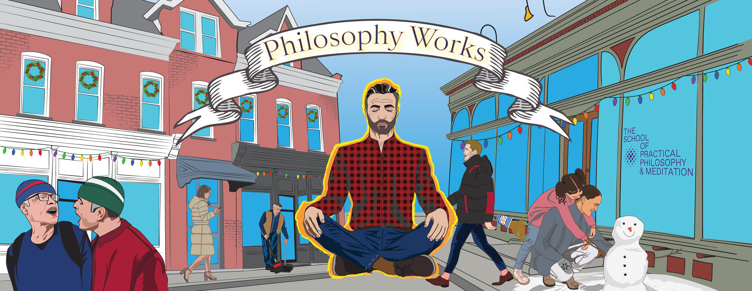
Winter Ad Campaign for the School of Practical Philosophy & Meditation
The winter MTA subway campaign’s in-car poster remained consistent with the fall design. However, the characters were given winter coats, beanies, the LGBTQ revelers became New Year 2024 revelers. The two men arguing along the bottom left were given NY sports team colored beanies. The mom and daughter to the right are making a snowman instead of tending to a garden. The bike deliver person has been given a winter coat, gloves, helmet and food delivery backpack. If one zooms into the helmet, it is decorated by WAK – WAK is the pronunciation for the Mayan hieroglyphic representing the number six. Places labeled six are cosmic realms in Mayan writing. As an ear decoration, this rendition of WAK wears a smart phone.
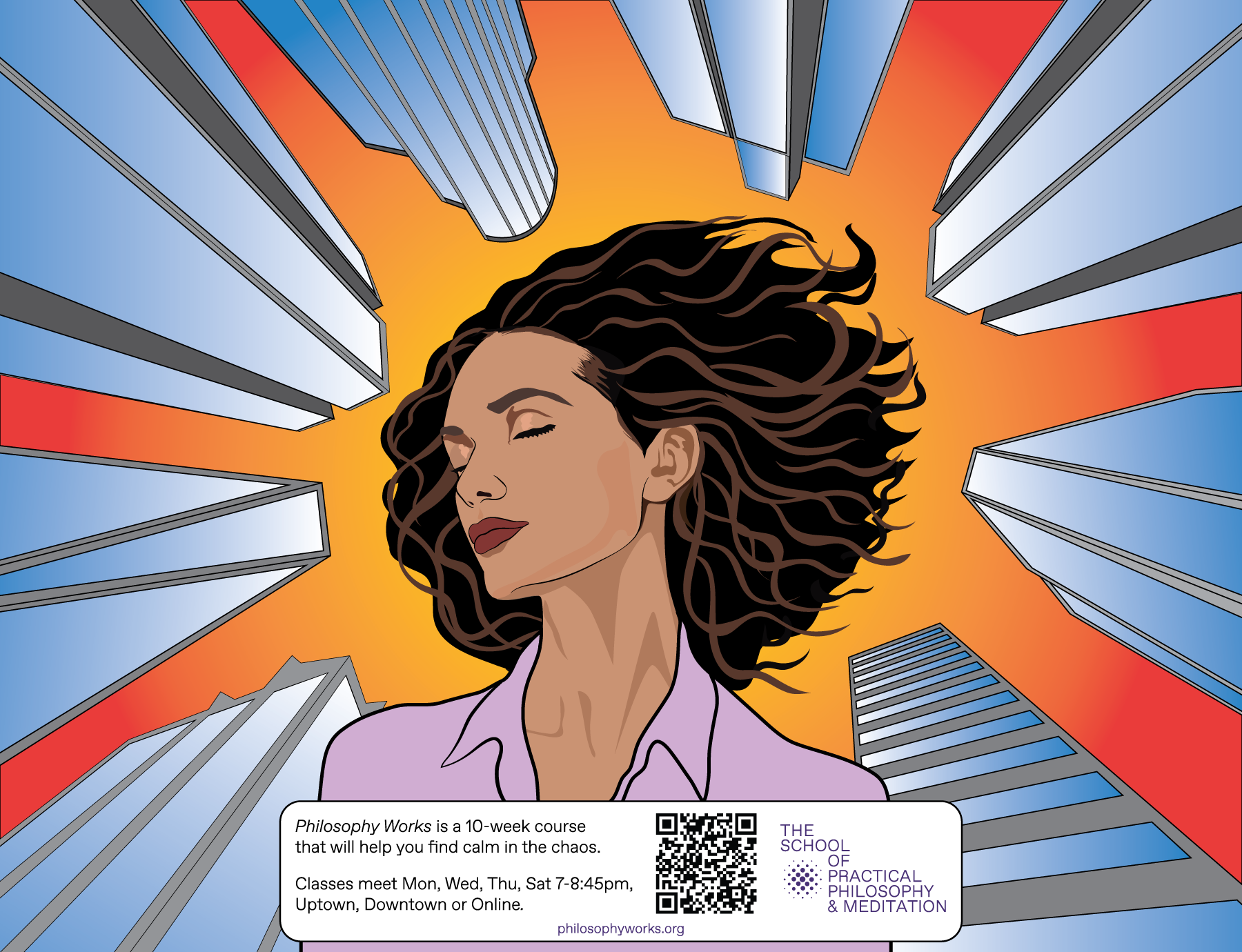
For the subway platforms, the creative director, Jaime Sears requested a new design. She envisioned a woman against skyscrapers, at ease as if meditating amidst the magnitude and intensity of New York City. Following her concept, I created a series of glass towers from the street perspective and placed a young woman with her eyes closed at the center, the towers rising all around her.
Lastly, I was asked to create a design for the Wallkill postcard. The budget was small and I was asked to work with existing assets, so I created a new setting and recycled the NYC characters. Linda Engler, a longtime member of the School who lives near the Hamlet of Wallkill where the School has an estate took photographs of New Paltz Main Street. Linda took the photographs to provide me with source material for the postcard. I used a photograph of the Indigo Velvet and Rock Candy Vintage building to help illustrate a New York town setting. I maintained the concept of an individual in meditation as the central element while other characters go about their lives. Hopefully, the postcard will visually engage viewers and draw them into learning about the School of Practical Philosophy and Meditation.
Latest Podcast Story

Nearly a year ago in January 2023, I encountered a series of after-school activities on my commute home from the Upper East Side to Brooklyn. During my commute, I regularly check my brokerage app. I collapsed that commute’s observations into a very short story titled “They Took All My Money in One Day” and then posted the story on this blog. As I maintain a podcast of short stories, really Science Fiction short stories, I decided to add my own story to the podcast, although it’s not Science Fiction. The story is however dystopian, a current-day dystopian reality… It’s only four minute listen:
https://www.ambriente.com/immersiveWorlds/
https://www.ambriente.com/immersiveWorlds/index.xml
Apple Podcast link: https://podcasts.apple.com/us/podcast/immersive-worlds/id1707925334
Philosophy Works 2023-24 Ad Campaign
“The School of Practical Philosophy & Meditation offers a journey of self-discovery that guides students toward understanding their innate wisdom and appreciation of the underlying unity connecting us all. Philosophy Works, the introductory ten-week course, prepares students for mantra-based meditation, an offering upon completion.”
THE CHALLENGE
In-person enrollment has been dropping for the last two years. The brand identity has gone through many iterations. We need a campaign that will once again establish the School as the NY community hub for Practical Philosophy.
THE GOAL
To reach our audience more efficiently, speak to their pain point and engage them with the benefits of PHILOSOPHY WORKS. We expect to increase our in-person Philosophy Works classes on the Upper East Side and Tribeca.
MY DESIGN APPROACH
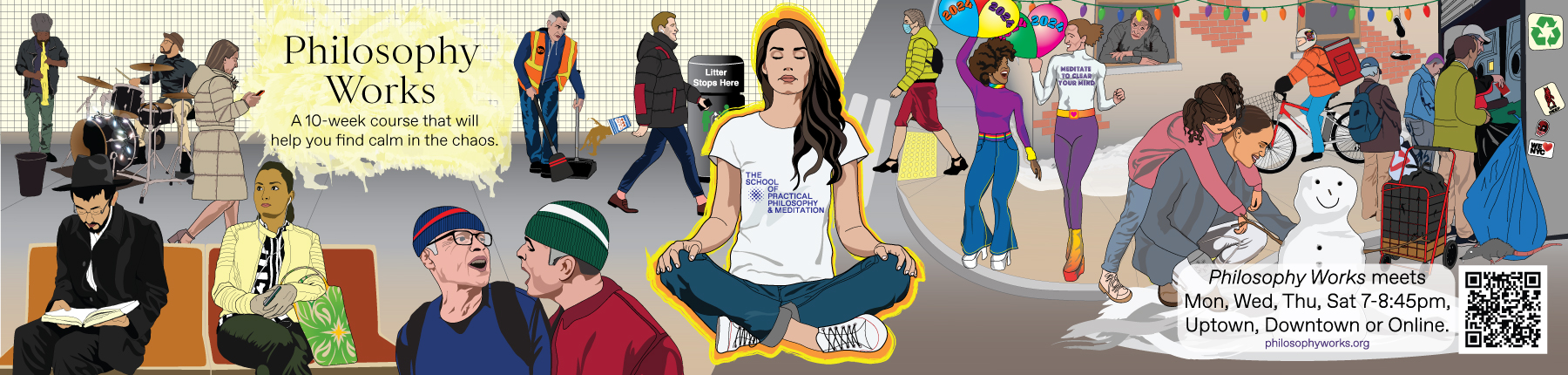
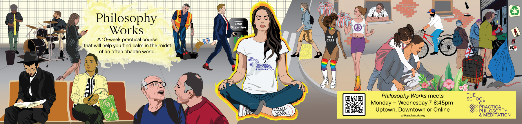
When on the subway, I seek out the illustrations commissioned by the MTA and I tend to lose myself in the stories that the illustrators create. I do not seek out advertisements. (Of course, I don’t need to as they can’t be missed.) Generally, the advertisements are not engaging. My approach to this project is to be a visual artist and storyteller, not an advertiser. My goal is to create an in-car advertisement that people may lose themselves in through illustrated New Yorkers and the possible interactions and activities of these characters. The School’s Creative Director, Jaime Sears felt that the advertisement needed to speak to the difficulties and uncertainties (“pain point”) commonly experienced by New Yorkers at this time. Ideally, the scenarios in the illustration will be familiar to most New Yorkers.
With these concepts in mind, I rode the subway and traversed the city. I photographed fellow commuters and eavesdropped on their conversations, observed their interactions. Specific individuals and life moments are represented in the final illustration. The majority of the characters in the final composition are real New Yorkers – commuters, pedestrians, recyclers, and even our infamous subway rats…
THE CAMPAIGN
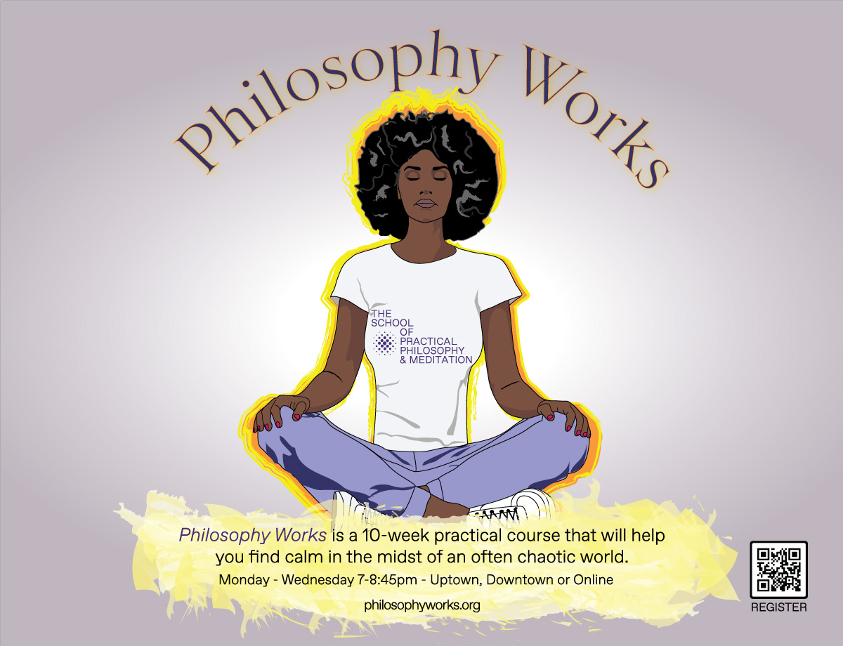
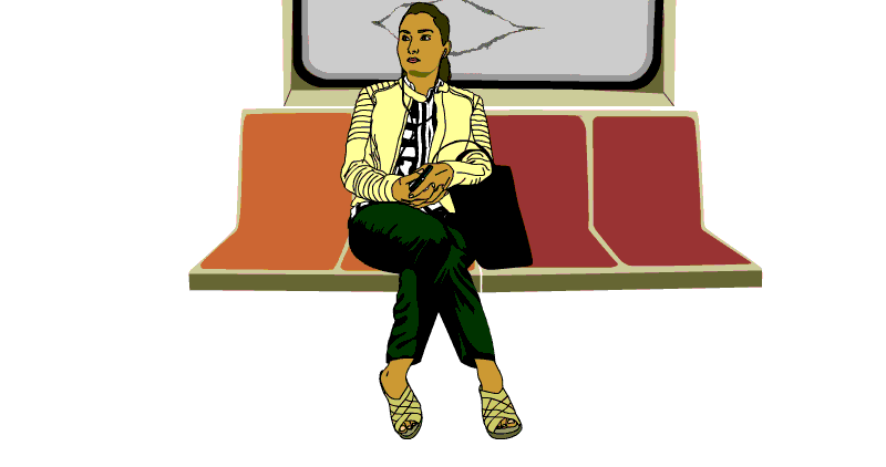
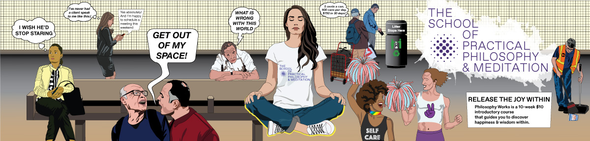
As meditation is a key element of the School and a practice known to calm people, I elected to have meditation be the central element to the design. Without the funds for a photo shoot, I searched online for people meditating. I found an attractive young woman sitting on the floor with her hands’ index finger and thumb touching. At the School, people generally meditate in a chair, however, design-wise, I felt that the chair would take up too much horizontal space, so I purchased the rights to the photo of the woman on the floor in a criss-cross applesauce pose and changed the hand pose. I based the central illustration on this photograph. I also wanted to make the name of the School central, so I placed the School’s name on her t-shirt at the very center of the design.
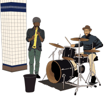
I surrounded the meditating woman with vignettes of everyday life from subway to street. Moving from left to right: subway musicians, a Hasidic commuter studying, a young woman with her earbuds in place, a businesswoman busily texting, two men in conflict, an MTA maintenance worker sweeping as he watches a business dandy toss his coffee cup on the platform floor with a trash can nearby… At the center, a woman meditating with a fiery aura outlining her figure. Then to the street (right side of the design) – a young female pedestrain wearing a surgical mask, PRIDE revelers enjoying life, an older man observing the street scene from his window, a mother and daughter gardening, a food delivery guy on his bike, and people recycling. A few of these illustrations, I had already created for past projects. The subway musicians and female subway rider I rotoscoped long ago for a series of animations reflecting New York City life. The rat and delivery guy are from a 2D video game and installation, una geografia de ser. Recycling past illustrations was necessary as the turn around on this project was very tight. However, the rest of the work is new.
I created a version of the graphic illustration with thought bubbles or spoken text for the various characters, but the School preferred that viewers interpret the illustration for themselves. Throughout the illustrations, I attempted to represent points of conflict that are common to the density of New York City.
The platform poster is much simpler and hopefully striking. It merely presents a woman meditating. Since people are on the platform for a shorter span of time, waiting to get on a train or exiting the station, I wanted to create a graphic that would immediately speak to the commuter.
Here are images posted in the subway cars and in the platforms:
Internalized Racism
A week ago, that is the last week of pandemic June 2020, my nearly 12 year old and I biked to Clinton Hill to visit a buddy of his. The friend’s block in Clinton Hill was having a “stoop day.” We arrived at the brownstone where his friend lives in Clinton Hill on the edge of Bed-Stuy around 1pm and the next door neighbors had their stoop party rolling.
The next door neighbors are Black and they were sitting at the bottom of the stoop behind a gate drinking and talking while one man worked the grill. Parked adjacent to the next door brownstone was a large white SUV with the passenger door open and music playing; it was the sound system for the stoop. A Brooklyn summer Saturday block party was just getting started.
My son’s friend and younger brother were outside, and greeted us. The mom stepped out, we had never met so after brief introductions, I offered to escort the boys to the Christopher “Biggie” Wallace Basketball Courts around the corner. Between COVID-19 and expected rain, the courts and playground were empty. The kids threw around a football, kicked a soccer ball and we headed back to their stoop.
The mother invited us to hang out on their stoop. I took a seat and we chatted as I watched the next door party grow. With each new arrival, a small explosion of laughter and cheer – a young man with a bottle of Hennessy and plastic cups, a middle-aged woman with beer in hand… it was a multi-generational gathering. At an apartment building across the street people were setting up tables with food. I could see that rain was coming, so we didn’t stay long.
On our bike ride back, as my son and I rode next to one another in Prospect Park, he mentioned that his friend (who is White) had said that “those people party all day long.” He said it in a judgmental manner. I told him that it’s Saturday and many people work Monday through Friday, so Saturday is a day to party and enjoy family and friends. I told him that it’s a good thing as I tried to dismiss the judgmental tone.
This immediately made me consider the difference between Black and Latino cultures versus White, particularly WASP culture. I assume that my son’s judgmental tone was picked up from his friend. I recalled 15 years back seeing the summer weekend stoop parties along Vanderbilt and reading the stories of the gentrifiers calling the police to shut down those stoop parties as they loudly rolled into the evening. Now there are no stoop parties along Vanderbilt and nearly no Black people.
Then I thought about my own family in Nicaragua. On Sundays (or Saturdays), my cousins regularly head over to their parent’s homes with their families and their drink of choice – one cousin adopted Titos a few years ago, others stick to Flor de Caña and uncles tend to elect whiskey or vodka. The weekend is commonly to gather and enjoy family. The kids play while the adults talk, drink and listen to music and everyone feasts on carne asada or pollo asado, tortilla, chicharron, tostones… At the larger family gatherings, it doesn’t always end well, occasionally simmering disagreements explode, words are said, but soon enough everyone will gather again.
When I was very young, my own parents would sometimes throw weekend parties. It wasn’t every weekend as we did not have much family around, but every few weeks and it was more friends than family. As I grew older, those parties ended. My dad worked whenever he could. If someone called in sick, he’d cover. He was a BART maintenance employee for 27 years. There were periods when he’d take a second job or try to run his own janitorial company or even drive to the airport and try to pick up passengers. It seems to me that when he was younger he enjoyed life a lot more and as he grew older he became more obsessed with amassing money. Perhaps it was having a family or making sure that all bills were paid off or being comfortable when he retired or he just had a lot of energy and with a family – why not use that energy for financial security… Whichever it was, my parents were immigrants that adapted to US life and culture, one in which work, not having debt and amassing money is central. (At least for poor immigrants, commonly, not living with debt is a goal.) However, in the US there are many cultures and amongst them Black and Latino cultures are more likely to maintain the importance of weekend socializing, drinking, music and partying. Whereas WASP culture is more likely to embrace isolation, the Weekend Edition of the New York Times, reading a novel, exercising in the park, silence and contemplation. And mixed in this is a bit of work – checking emails, checking bank accounts, perhaps moving a bit of money… They are not likely to tolerate loud music and regular weekend parties.
All this said, the reason behind this reflection is my disconcert at my son’s judgmental tone at the idea of people partying all day long and underlying that judgmental tone is a trace of racism. I present two radically different measures of the value of life. One is based on productivity whereas the other on joy. One may find joy through accomplishment, the other finds joy in joy itself. One has a puritanical and protestant root with a moral basis whereas the other has “savage” root with a hedonistic basis. However, the savage hedonism has been tamed or civilized, because it is only after a week of hard work that the pursuit of pleasure for the sake of pleasure is enjoyed. And in writing this, I display my own implicit racism.
Pope.L Bougie Irreverence
It is difficult to call any art placed in a blue chip Chelsea gallery irreverent, but Pope.L tries his best. Currently (9/13 – 10/27 2018) at Mitchell-Innes & Nash, Pope.L “One Thing After Another (Part Two)” stocks the gallery with collaged digital prints, framed found trash, assemblage, photo-collage, and a video of an erect penis attempting to balance a white whip cream pie. (As you might guess, the cream pie tips off the big, hard, black dick; only Brett Kavanaugh’s small white penis would hold that pie up.) The video is hilarious and I wish I had recorded a bit of it to include it here. It is a sharp and whimsical comment on desire, sex, race and privilege or rather lack of. The white pie and black dick are accompanied by a smoking digital black sock puppet that rises and forms like a snake from a corner of the video image.
The digitally printed collages tear apart political and celebrity figures, mockingly reframing them in unexpected contexts and pairings. Across the gallery, William Pope.L has inserted himself into historical photographs. Again, the visuals are at once comical and critical recontexualizing a problematic racial history of the United States.
Pope.L effectively reminds us to always look at the images we are fed with a critical eye. Question the images – where are they coming from, why are they being presented and what is it that they represent? What is our place in this culture? But in the end, lets not take ourselves too seriously, be creative, have fun, but always be smart.
Zach Blas Contra-Internet at Art in General
Contra-Internet: Jubilee 2033 trailer from Zach Blas on Vimeo.
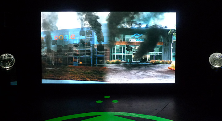
I had been looking forward to seeing Zach Blas’s Contra-Internet exhibition at Art in General, unfortunately it was not as engaging as I had hoped. The exhibition presents one single channel video installation that features the nearly 30 minute film “Jubilee 2033” and three other single-channel video works on monitors. The three video works on monitors present ideas and research regarding the internet – the hegemonic network of today and for the foreseeable future – through computer screen recordings by Blas. (I really hope that artists stop using screen-recordings of themselves clicking through files as a medium; it’s seldom interesting.)
Although I was disappointed by the exhibition, the gravity dance performance by Cassils as Nootropix, “a contra-sexual, contra internet prophet” is captivating an entirely worth the trip. The premise of the film is funny as it opens with Ayn Rand discussing the future of her ideas with two of her followers – Alan Greenspan and a fictional character Joan Mitchell. A young Greenspan proposes that the group take an acid trip. I was turned off by the highly accented performance of Rand and her cult, so I was glad to see them drop liquid acid.
As the trip begins, an internet connected artificial intelligence in the form of a manga character appears and takes them in to the future. The future is of course dystopian as the present reality burns and it’s certainly fun seeing the Google headquarters burning along with other tech companies in the not so distant future of 2033.
Along their travels, we encounter tech workers being taken hostage by “The Art Professor” wearing gray, paint-splattered coveralls and wielding a machine gun. Later in a classroom, the Art Professor introduces Nootropix (Cassils) who in their monologue states that they will perform the creation of gravity. The performance artist is powerful and their dance upon a purple matrix while dawning a large, erect, glowing CGI penis that is constantly spewing black liquid is awesome. The dance is mesmerizing and triumphant.
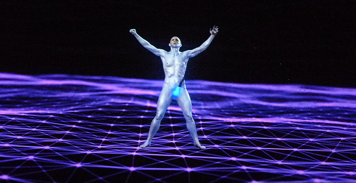
In Nootropix, Blas presents one of his contra-internet exotic creatures “to discover or create a world of network difference.” I could have entirely skipped the storyline, and merely be fantastically transported by Cassils’s character and performance as I think that it would have left me asking more questions and appreciating the mystery. We know that a network of difference is not plausible, so why not create the fantastic and shed the tedious philosophizing.
“Hansel & Gretel” at Park Avenue Armory – Save Your Money
The “Hansel & Gretel” curatorial statement describes the installation as a space that brings together Jacques Herzog, Pierre de Meuron and Ai Weiwei combined interests in
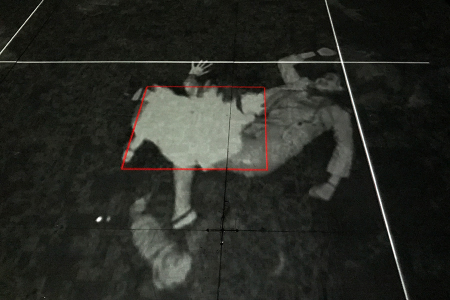
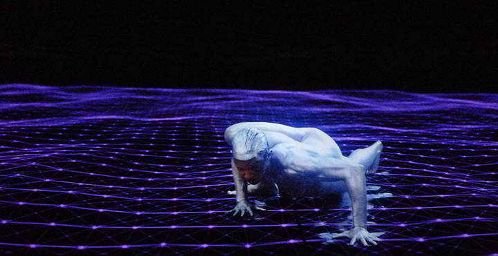
the psychological impact of architecture and the politics of public space; creating a playful, strange, and eventually eerie environment with different layers of reality revealed to the visitor… Hansel & Gretel is a dystopian forest of projected light where the floor rises up, as if lifted by an invisible force, and visitors are tracked by infrared cameras and surveyed by overhead drones as they systematically capture the parkgoers’ data and movements…
Unfortunately, the only portion of this description that resonates is the playfulness. Indeed Herzog, de Meuron and Weiwei have created a dark environment in which visitors may skip around and play with light traces of their image. However, the installation lacks strangeness, eeriness, politics or any psychological reverberation.
Other than the initial moment of discovery that one’s image is being projected on to the ground after it is periodically taken due to on one’s movement in the space, the installation presents very little that is interesting. The drones may have been a neat prop had they not been tethered.
The second part of the installation is a didactic revelation of what the installation is trying to allude to – that we are objects of surveillance. As far as a critical art installation regarding surveillance, there was much more interesting work done 15+ years ago. Perhaps the theme of surveillance has been so overly investigated and picked apart by art previously and by entertainment today (“Black Mirror” for example) that such an installation seems trite and naive. There is so much of our data being captured today, that building an installation that merely plays upon facial recognition and motion sensors is just kind of dumb, but it is playful. So if $16 is worth the cost of running around a huge dark open space and playing with light projection, check it out.
A second perspective: Playtime at the Armory
Once again discovering what this city has to offer, there I was with Ricardo walking into a venue called the Armory near Hunter College, a place I had never been before to see a new art installation called “Hansel & Gretel”. He had been keen to check this out for a few weeks, and like the curious creature I am, I followed along.
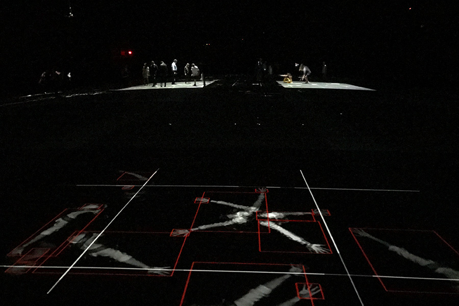
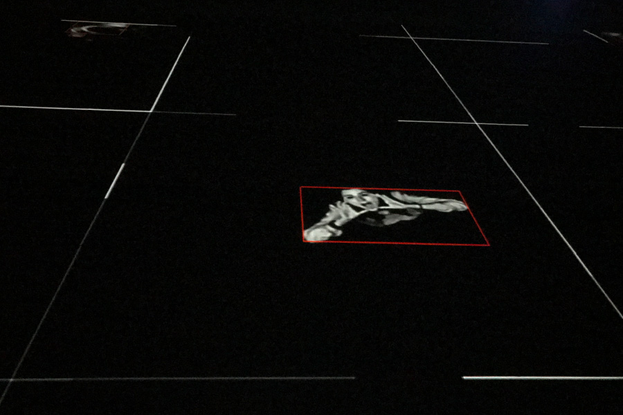
We received a quick intro and were instructed to read a phase on the wall before entering -which i forgot- and then allowed to enter. We walked into black nothingness. My immediate reaction was to scramble for Ricardo’s hand. I didn’t realize the massiveness of this place until my eyes adjusted from the summer sunlight to the darkness inside of the Armory. It was only eerie the first few minutes because I had no idea where the hell I was walking. There were a few cameras far above us hanging from the ceiling and lights that would follow us. As we continued to walk, our movement was detected, grid lines would appear and cameras would be activated to capture our moves. Suddenly, it was playtime! It was fun to pose in different positions to watch the resulting snap shot of yourself illuminated on the black floor. At one point my sweater and shoes came off and I really got into it.
Ricardo noticed two drones hovering on one side of the space living poor unfulfilled lives- tied onto leashes without free movement. It would have been more interesting if they were chasing people around. After exhausting our ideas for poses, the novelty wore off and we were ready to enter part deux of the installation. For that, we had to exit this part of the Armory and enter from another entrance on the other side of the street.
After pausing in front of a camera you were allowed inside. There were many ipads on long tables with apps. You could elect to have your face identified and then search the cameras for your photo which was taken in the first part of the installation. That was cool. You could read about the history of surveillance, or access cameras to spy on others walking into the exhibits. The Armory itself was impressive, the installation not as much. It was a new, interesting experience- a fun activity for kids, I would say. I didn’t leave with the feeling that I had witnessed an impressive statement against today’s constant scrutiny and monitoring that we are all under. I didn’t feel intruded upon. There wasn’t anything menacing or fantastical as is described in the program leaflet. It was just pretty cool and fun.
Perhaps the work behind the installation was complicated, but with my lack of technical know-how, I failed to appreciate the amount of effort involved. To have truly made an impact, more could have been done to confuse or play with the audience with the intention of throwing them off or perhaps even scaring them. Coupling that with the sound of Russian men having conversations in the background (that felt clandestine in nature), and I would have possibly left quite feeling differently.